

Executives need a high-level view of a business’s health. At a glance, they need to see and understand trend lines and data points, and know the answer to the question, “Are we tracking in the right direction?” They’ll also need to dive into those key metrics to know which successes to replicate and what areas of the business need attention now.
But the issue is that executive dashboards often fail to deliver any real strategic value. Below, we aim to simplify the executive dashboard and make it more actionable. First, by outlining exactly what it is and why it’s powerful. Then we’ll cover some example dashboard designs executives can use to track true performance — not just high-level KPIs.
Table of Contents
What Is an Executive Dashboard?
An executive dashboard is a visual tool that combines key financial and business performance metrics so C-level executives can get a high-level visual representation of their company in real time. An effective executive dashboard must connect seamlessly with data sources and make information actionable. In other words, it should make it obvious what areas of the business need attention — either to address weaknesses or to reproduce strengths — and make it easy to share information with other decision-makers.
There are many ways to track big-picture operations. The metrics and KPIs tracked and chosen for the executive dashboard should be tailored to the user’s needs. That being said, the KPIs the dashboard shows should make the data obvious in how it tells its story — that means using multiple visualizations (graphs, tables, etc.) to ensure the most important details of the story are captured.
When deciding on metrics to include in your dashboard, reflect on your last or upcoming board meeting (and review these SaaS board meeting tips). What KPIs were most important to stakeholders and board members? What do you need to tell your company’s growth story and run a productive board meeting? Let your answers to these questions guide your choices when setting up your dashboard.
Types of Executive Dashboards
Strategic dashboards come in all shapes and sizes depending on the needs of the executive in question. Most executives will want more than one reporting dashboard to cover current business initiatives. Here are a few dashboards an executive might set up and monitor:
- Operational dashboards
- Forecast vs. actuals dashboard
- Sales management dashboard
- Marketing dashboard
- Chief Financial Officer (CFO) dashboard
- Human resources dashboard
Ideally, your dashboard software provides customization so you can include any performance metrics that are important for your audience.
Benefits of Dashboards Tailor-Made for CEOs and Executives
Better strategic decision-making begins with real-time operational and financial data organized to make sense to you, the executive team, and the business’s goals. Measuring where the business has been and could be is the key to dreaming up, implementing, and refining a winning plan through data-driven business decisions.
- Benchmark KPIs against your plan. Your dashboard should let you know at a glance that you’re on or off the right track.
- Improve visibility. Your dashboard should make need-to-know information as visible as possible
- Save time. When problems are spotted, your dashboard should make it easy to dig into the details and generate reports to share with your team.
- Optimize internal and external communications. Data visualizations help you tell your story more compellingly, bringing your team or investors on board and up to speed.
- Streamline talent management. With a clear picture of your team, you can see how well you’re attracting, building, and retaining talent.
- Boost profits. When it’s easy to see how a business is performing, it’s easier to design solutions that fix issues quickly and generate profits more efficiently.

3 Best Executive Dashboard Examples
You can set up an executive dashboard to include anything you collect data on. The key here is organizing the data so that your financial storytelling comes through successfully. Most executives will want to keep an eye on more than one business goal, and we recommend creating as many dashboards as you need to keep a close watch on progress (without inducing visual overwhelm).
Below, we’ve created three sample dashboards that might be used together to create, monitor, and refine strategy.
1. Forecast vs. Actuals Dashboard
This dashboard needs to answer the questions, “What did we think we’d do, and what did we actually do?” It should highlight budget vs. actuals while providing the granular detail to help you and your team understand why the variance occurred.
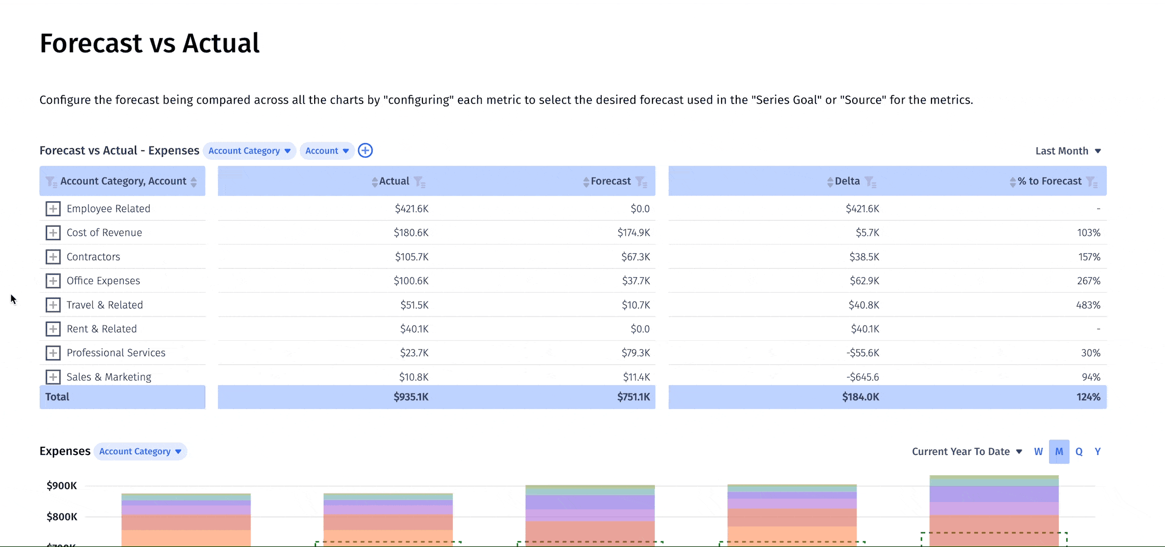
For this dashboard, we integrate with our HRIS, CRM, ERP, and billing systems to closely follow these metrics and financial statements:
- Total revenue
- Cost of revenue
- Operating expenses
- Income statement
- Net burn
- Balance sheet forecasting
- Headcount categorized by department
- Short-term cash balance
It’s also useful to organize the data so you can visualize
- How current metrics compare to planning (our example uses dotted lines to show the baseline)
- The composition of each metric (sources of income, spending categories, etc.)
- Changes in the metric over time
This way, you can immediately tell when you’re over or under the mark and what details need a closer look to understand why.
2. Operational Efficiency Dashboard
Market changes have influenced many leaders to move from a growth-at-all-costs strategy to an efficiency-driven model. The operational efficiency dashboard should be designed to make operational problems obvious so you know exactly where to look to improve processes. And it should present up-to-the-minute, interactive data so users can pinpoint the exact obstacles in question and get to the problem-solving stage.
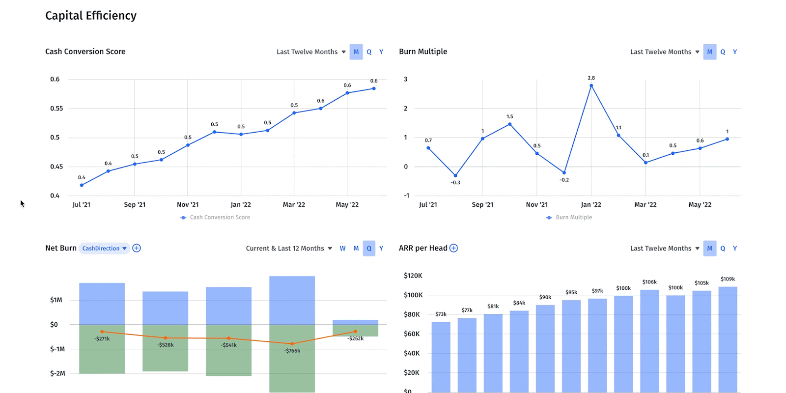
Your operational efficiency dashboard should present the metrics most important to current company performance. We’d include:
- Accounts payable (AP) aging shows open bills and dates since the billing date
- Accounts receivable (AR) aging shows open invoices based on the date of the invoice
- Burn multiple shows the return on deployed capital
- Capital efficiency ratio showing how the money spent growing revenue is generating revenue
- Cash conversion score shows the ARR generated with cash, equity, and debt
- Cash inflows and outflows a.k.a net cash flow
- Expenses separated into key categories (by department, by project, etc). Companies often have a separate expense dashboard, but piping this data into your exec dashboard is important
- Gross profit subtracts the cost of revenue from revenue
- Gross margin divides gross profit by total revenue
- Net operating income profitability before accounting for taxes, debt, and interest
- SaaS Rule of 40 to ensure combined revenue growth rate and profit margin excess of 40%
You’ll also want to see metrics that illustrate your acquisition efficiency, including the SaaS quick ratio, SaaS magic number, CAC ratio, and CAC payback period. And to keep your dashboard in real-time, integrate it with your billing and payment system.
3. Pipeline Analysis Dashboard
For a VC-backed startup, revenue is everything. You’ve got to know how and why you’re growing and be able to show it. A pipeline analysis dashboard gives a full view of the pipeline your team is building so you can determine if it’s big enough to hit revenue goals — or if you need to make bigger goals.
Sales pipelines are complicated and can fail for any number of reasons. A great pipeline analysis dashboard makes it easy to spot issues, dig into the details, and collaborate with your sales and strategic finance teams to improve workflows.
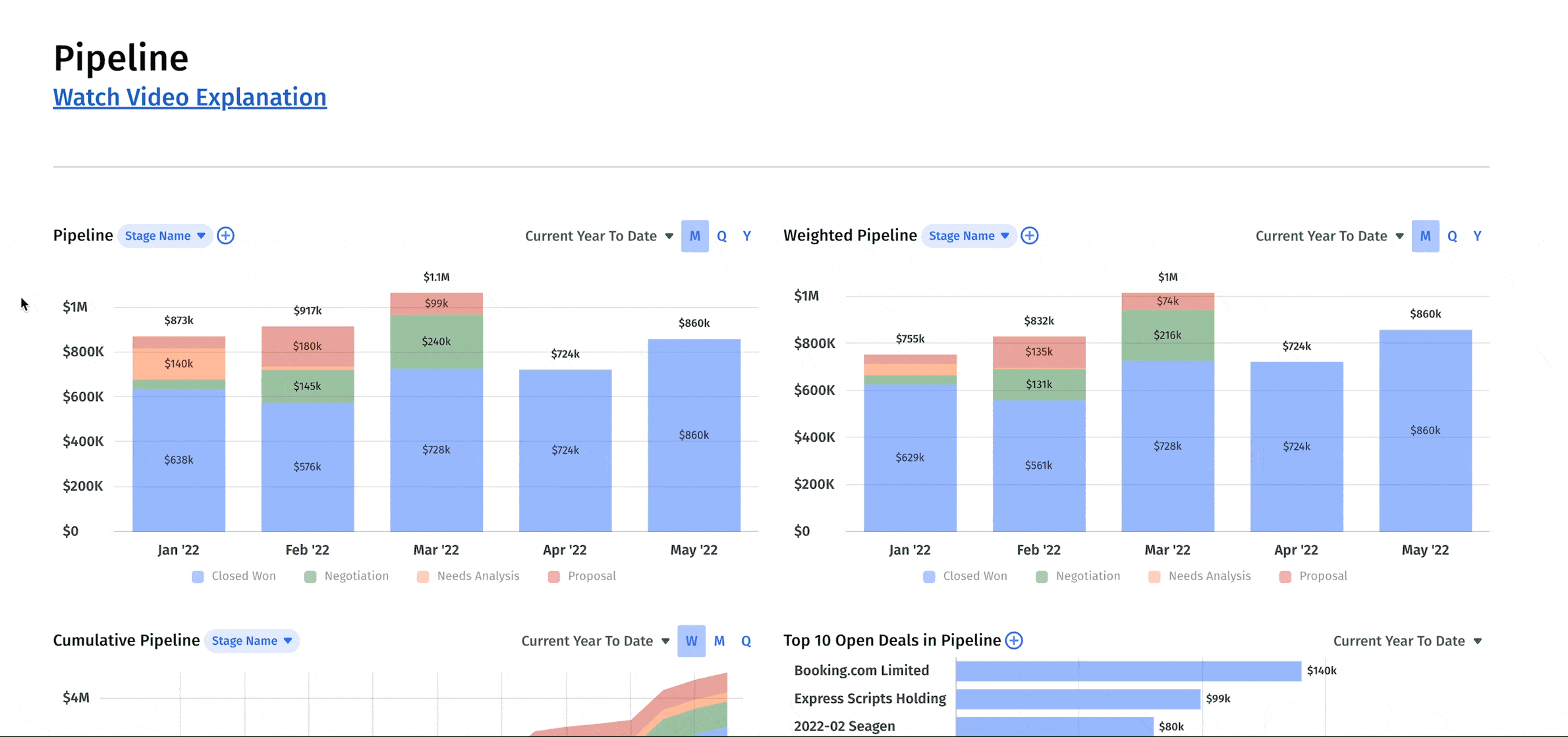
Our dashboard includes these sales pipeline metrics:
- Pipeline includes open deals and closed won/lost summary.
- Weighted pipeline forecasts the probability of closed deals currently in the pipeline based on historical data.
- Cumulative pipeline showing all open and closed-won deals over a period.
- Top 10 deals within pipeline shows you which deals make up the largest portions of your pipeline.
- Pipeline list showing each prospective deal and where it is in its lifecycle.
- Won opportunities list includes all won opportunities for a period.
- Lost opportunities list includes all lost opportunities for a period.
- SaaS bookings list showing the total value of existing and new deals signed for a period.
- Stale pipeline list including open deals with closed dates in earlier periods.
This dashboard pulls data from your customer relationship management platform. .
Metrics Every Executive Should Track
There’s no one-size-fits-all group of high-level metrics most important to CEOs, but there are a handful of KPIs executives need to keep an eye on. Metrics about the topline, total headcount, expenses and operational efficiency generally rule the day. But only you can know exactly which metrics are KPIs for your company.
Here are the metrics we’d be sure to consider:
- Annual recurring revenue (ARR)
- Net new / Gross new ARR
- Customer lifetime value (LTV)
- Customer acquisition cost (CAC)
- Customer count
- Churn rate
- Net dollar retention
- Cash balance
- Expenses by category
- Top 10 Vendors
- ROCE
- Burn multiple
- Headcount
- Headcount composition
- Headcount starts and ends list

Customize Your Executive Dashboard with Mosaic Canvases
Tailor-made dashboards are nothing without functionality. With Mosaic’s interactive dashboards, you can connect with all the tools in your tech stack, automate KPI calculations, and get real-time insights instantly — no Excel spreadsheets necessary. And you can arrange that data with drag-and-drop charts, graphs, and tables. Mosaic’s library of visualizations is customizable for your data and brand formatting (colors, fonts, etc.), and you can arrange data analytics in the way that makes the most sense to you.
Unlike other integrations, Mosaic’s Canvases aren’t one-view instrument panels. They’re more like a virtual sandbox for your data sets and business intelligence tools where you can drill down into the details when necessary. And you can invite anyone in your company to collaborate, comment, and strategize.
Unsure of where to start? Start with a basic template and customize as you go. Want to learn more about building top-level dashboards in Mosaic? Request a personalized demo.
Executive Dashboard FAQs
What should be on an executive dashboard?
An executive dashboard should track the metrics that provide the best high-level picture of business performance based on a company’s needs, maturity, and business objectives. Incorporating a comprehensive SaaS dashboard can provide real-time, in-depth analytics for informed decision-making. Though highly subjective, executive dashboards typically include key performance indicators related to expenses, net burn, topline, and headcount. It should include crucial SaaS metrics such as CAC, LTV, and customer acquisition spend.
What is a CEO dashboard?
How do you build a CEO dashboard?


Own the of your business.