

A SaaS dashboard can easily become an indispensable tool for delivering actionable business insights. Executives and their teams can use them to address weaknesses, drive growth, and stay ahead of the curve. For a more comprehensive view tailored for top-level executives, consider exploring an executive dashboard.
But there’s a big catch: they need a dashboard that is continuously up-to-date, accurate, visually appealing, interactive, and shareable with all stakeholders. Plus, it needs to include data that surfaces insights about improving the business.
Unfortunately, most SaaS dashboards fail to deliver on both fronts. They’re either beautiful and lack deep insight or loaded with data and indigestible..
This article will show you how a well-constructed SaaS dashboard can balance practicality with usability. We will spell out exactly what a SaaS dashboard should include and walk you through four dashboard examples you can use to build your own.
Table of Contents
What Is a SaaS Dashboard?
A SaaS dashboard is a business analytics dashboard that allows strategic finance leaders, CEOs, and other stakeholders to monitor and manage their organizations. It organizes data and tells a visual story of a SaaS company’s past, present, and growth trajectory. It tracks SaaS KPIs and other important metrics that support comprehensive analysis of both operational and financial performance. The dashboard should be interactive so viewers can explore and manipulate data for deeper interpretation.
The SaaS dashboard functions to spur actionable insights and provide building blocks for collaborative strategic planning. Metrics typically tracked in this dashboard include
- ARR and monthly recurring revenue
- Customer acquisition cost
- Customer attrition
- Average revenue per user (ARPU)
- Customer lifetime value (LTV)
- Cash runway
Get The 10 SaaS Metrics You Didn’t Know You Needed

What a SaaS Dashboard Can Do for Your Business
The best SaaS leaders work proactively, capitalizing on growth opportunities early and addressing any operational issues before they significantly impact performance.
But the only way to manage this is to maintain total awareness of your most important metrics. The more visibility you have into where recurring revenue stands, how efficiently you’re acquiring new customers, and how well you’re retaining your existing customer base, the easier it will be to make data-driven decisions about your growth plans.
That’s the crux of what a SaaS dashboard can do for your business.
Gather SaaS Metrics in One Place
Collecting and viewing key metrics in one place fosters deeper analysis and helps you generate more comprehensive strategic plans. Seeing the high-level view of data helps you uncover hidden relationships. It also keeps you on target with all key initiatives no matter what. Sometimes a five-alarm fire in one aspect draws attention away from other important places.
Give Leaders Real-Time Visibility of Performance
Your dashboard is only as good as the data is accurate and fresh. Great SaaS dashboards offer wide use of integrations with SaaS analytics tools, so the dashboard carries information straight from the data source. This reduces opportunities for human error to skew the numbers while providing the most up-to-date information.
Deliver a Visual Language Everyone Can Understand
Datapoints are useful in general, but how teams see and interact with data impacts how efficiently they turn it into insights and next steps. Data visualization makes it easy to interpret and compare data sets. This may seem very basic, but it should not be underestimated due to its simplicity.
Data visualizations draw the eye to the most important details, like a magnet. They can help you spot trends faster and identify outliers, giving you a starting point for deeper ad hoc analyses.
Foster Company-Wide Transparency and Collaboration
The whole of a SaaS company is greater than its parts. When you share the SaaS dashboard with the entire organization, you lay the groundwork for diverse feedback loops and greater, more nuanced collaboration. With a clear picture of their company, team members can use company data to improve their work and discover new opportunities to move the needle.
Make Data More Interactive
Dashboards also encourage deeper interaction with the data over time. Because it is so easy to get a full picture of your business and how it’s performing its most important functions, dashboards lend themselves to daily use. People who make a practice of checking the score become better at spotting potential issues and any changes in performance. They also prime their pump for more imaginative solutions.
Support Smoother Planning Processes
Preparing for what’s next takes excellent forecasting, headcount planning, and budget allocation. You’ll also need buy-in from team members. A SaaS dashboard lets you create and share research and findings. Real-time visibility gives way to proactive, data-driven insights.
Create Dynamic Dashboards with Real-Time Data and Rapid Insights

How to Build a SaaS Dashboard for Your Business
Before you start building, you need to lay foundational work to ensure it tracks the goals and growth most important to your business right now.
Below, we outline every step in building a highly-functional SaaS dash, from ideation to insights to implementation.
1. Set Goals
The SaaS business model is built on recurring revenue, so goals in this model generally center on:
- Gaining new customers
- Keeping existing customers
- Increasing the efficiency of gaining new customers
- Operating and managing investments efficiently
Each part of the SaaS dashboard should be constructed to give a high-level view of where each goal stands. It should also offer you the ability to drill down into the details.
2. Designate KPIs for Each Goal
KPIs best illustrate the health of your business and how it’s doing in pursuit of its goals. They’re often not illustrated by a single metric but by a group of interrelated ones. Each goal should have between one and four KPIs, plus a handful of related metrics. The key performance indicators we’d expect to see in a SaaS dashboard are:
- ARR and MRR
- Net revenue retention
- Customer churn
3. Decide on Related Metrics
KPIs aren’t easily summed into one metric. Related metrics add nuance to the story and uncover variation in outcomes. For example, reviewing the ARR of customer cohorts adds shading to your current ARR and contracted ARR. Then you can see where your team saw the biggest successes and failures.
There are many SaaS financial metrics to choose from. The key is to focus on the ones that add details to the story of your business. We’ll show you four ways of doing that a little later in this article.
4. Build a Dashboard (with or without Dashboard Templates)
Especially if it’s your first time using a dashboard, templates offer a quick and easy way to get started. You can always customize your template to include additional metrics in the future. Or you can construct your dashboard metric by metric.
Here’s an overview of the steps in building a SaaS dashboard.
- Sync with SaaS business intelligence tools
- Use a dashboard template or build your own dashboard from scratch
- Review data
- Investigate successes, failures, and outliers
- Turn insights into actionable steps
5. Share Your Dashboard with Your Team
This is where the magic happens. These dashboards are part instrument panel, part whiteboard. It’s a place to see past and present performance. And a place to collaborate with your team and determine:
- Common goals
- Opportunities for growth
- Benchmarks and checkpoints
- Insights and how to implement them
SaaS Dashboard Examples
Now that you understand the theory, let’s look at some examples of SaaS dashboards in action. Below are the four canvases that we’d include in our SaaS dashboard, the metrics we’d follow, and any special considerations.
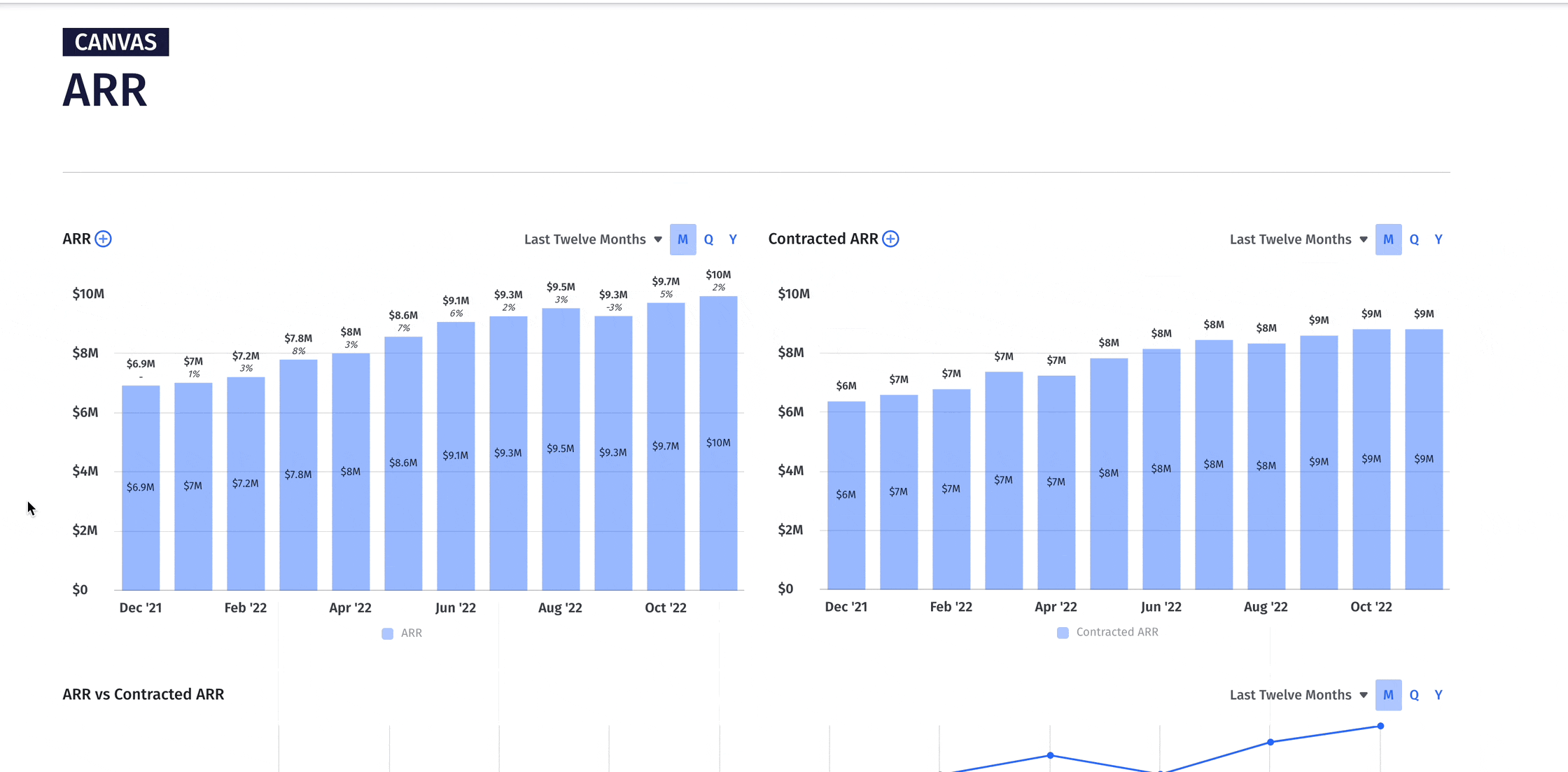
ARR Dashboard
Annual recurring revenue is the heart of the SaaS business model, so it should be top of mind on the SaaS dashboard. This is where you see the story of your expansion revenue, contraction revenue, and customer cohorts. It not only answers, “are we growing?” but also, “where are we growing?” And the insights gained here drive ARR growth.
Because ARR is the lifeblood of the SaaS model, this dashboard needs to make any issues or potential issues glaringly obvious. Viewers should know at-a-glance if something needs a close look.
We’d construct ours to include the following KPIs and metrics.
- ARR
- Contracted ARR
- ARR changes, including new customers, upgrades, downgrades, and churn rate
- ARR composition by year
- Top ten customers by ARR
- ARR by head
- Customer cohorts ARR
As a final note, it’s important to customize data visualizations to ones that tell the clearest story of your data. For example, we used a heatmap to illustrate customer cohorts. It makes cohort analysis easy by highlighting where you need to drill down into the details.
From this analysis, your team can better understand when customers are most likely to downgrade, churn, or upgrade. And this provides the basis for new strategic thinking.
Retention Dashboard
Here’s the silent engine of recurring revenue. ARR cannot function well without good customer retention, so a SaaS company that doesn’t prioritize and monitor retention metrics won’t last long. There’s never a bad time to keep a close eye on trends, but it’s especially important to perform a retention temp check in preparation for large growth periods.
The retention dashboard that allows for easy analysis is a dashboard that gets you results faster. Here are the retention metrics we’d include on this KPI dashboard.
- Net dollar retention
- Gross dollar retention
- Churn
- Customer (logo) churn
- Customer cohort ARR
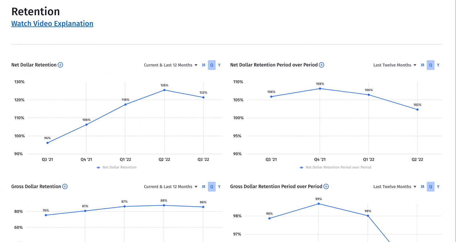
Being able to manipulate data visualizations — graphs, tables, pie charts — lets you tell the story of your numbers in a way that sparks engagement. Multiple views on the same data also deepen your understanding of the metrics. For example, our dashboard shows net and gross dollar retention separately, so viewers can see the metrics as they stand alone.
But we also include a graph that overlays the two, so we can see how the two function together.
SaaS Acquisition Metrics Dashboard
Without a deep understanding of both your acquisition and retention metrics, ARR analysis is incomplete. For this reason, we’d include an acquisition dashboard as a place to monitor and spur progress.
First, you’ll want a portion of the dashboard focused on go-to-market metrics. This includes anything that tracks how much is spent on sales and marketing.
- Acquisition spend
- CAC
- CAC ratio
- CAC payback
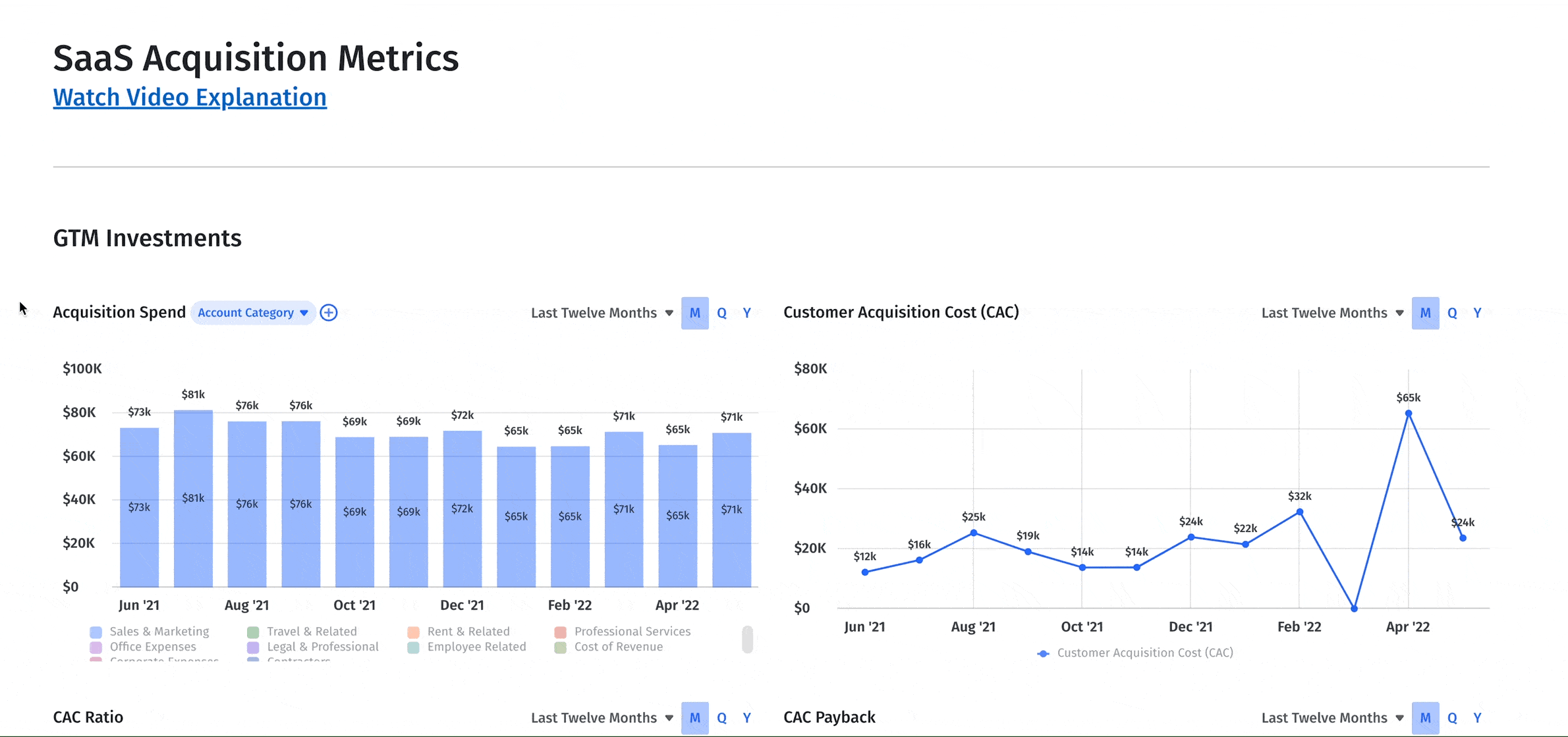
In addition to what you’re spending, you’ll want to see what you’re generating from that acquisition spend. GTM return metrics include
- Customer lifetime value LTV
- SaaS magic number
- Customer cohorts scheduled revenue
Operational Efficiency Dashboard
Here’s one more viewpoint we think deserves to be part of the SaaS dashboard. Generating revenue is only as good as the ecosystem that turns it into growth. This is where the operational efficiency canvas comes into focus.
This is where you and your teams can track how workflows and team effort contribute to company goals. More than a scoreboard, it nurtures company culture. It inspires proactive action, company-wide commitment, and full collaboration.
There are many operational efficiency metrics to choose from, but we think the following are indispensable:
- Capital efficiency: Cash conversion score, burn multiple, net burn, and ARR per head
- Path to profitability: Gross margin and net income
- Acquisition efficiency: SaaS quick ratio, magic number, CAC ratio, and CAC payback
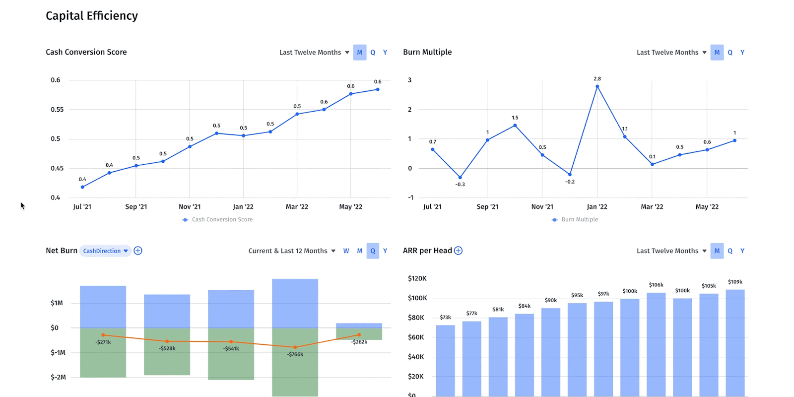
That being said, every SaaS business model is unique and should change as the company grows and matures. This is one more reason why customizing dashboards as things change is such an important feature.
Mosaic Offers Tailored SaaS Dashboards As Unique As Your Business
In the highly competitive, tightly contested world of SaaS startups, the aggregation of marginal gains is what ultimately puts one business ahead of another. This is why collaborative company culture is so important. When the whole team is looking for ways to grow, the entire company benefits. But sharing groups of Excel spreadsheets isn’t going to cut it.
Mosaic’s tools cultivate organization-wide collaboration. Our plug-and-play platform easily integrates with your CRM, ERP, HRIS, and billing systems to provide real-time insight into company performance. With the flexibility to filter and cut your data in real time, Mosaic gives you dashboards that are more than just scoreboards — they’re tools you can harness to foster open discussion and strategic thinking.
Getting started with Mosaic is as simple as selecting a template and connecting your tools. You can customize or build a fully custom dashboard from a blank canvas. Ready to learn more? Get a personalized demo.
SaaS Dashboard FAQs
Can dashboards assist in evaluating the effectiveness of a pricing strategy?
Yes, by tracking metrics like revenue growth, conversion rates, and customer acquisition costs, and analyzing these metrics in relation to pricing changes, you can gauge how pricing adjustments impact user engagement and overall profitability.
What features should I look for in a metrics dashboard to ensure it supports informed decision-making?


Own the of your business.