
Coaching a sales team without robust data is like coaching a basketball game with your eyes closed. That’s where a sales dashboard can help. Your sales dash is a visual tool for monitoring and guiding your sales team to success. They’re more useful and efficient than building visualizations in Excel, making it easier to present information in a variety of formats. And they can automatically update information from your sales tech stack.
In this article, we discuss the power of a well-equipped sales dashboard, covering what they are, the metrics they can contain, and how to use them. By the end, you should have a solid understanding of how sales dashboards work and how they can help your team achieve their goals and improve their processes.
Table of Contents
What Is a Sales Dashboard?
A sales dashboard provides a visual representation of sales data and sales metrics. Ideally, it syncs with a business’s entire sales tech stack to gather all important information in real time. An effective dashboard design provides this data in a visually captivating way (e.g., graphs, pie charts, bar charts). And the visual nature of the dashboard makes it easy to see where problems exist and allow the user to drill down into the data. With it, sales managers and their teams can glean actionable insights and find a solution sooner.
But sales dashboards, similar to how a CFO dashboard operates, are about more than monitoring. They also provide valuable insights to guide strategic finance decisions and provide a gut check to assumptions. For example, say your team plans your sales team hiring around a four-month sales ramp to full production. Yet when your team reviews the numbers from the last year, you discover sales reps take six months to reach full production. Now you can adjust your headcount plan to accommodate the longer sales ramp.
Why Sales Teams Should Use Dashboards
A sales performance dashboard provides a place for sales managers and their teams to review performance, make sales forecasts, build a more efficient sales strategy, and drive revenue growth. Great dashboards are all about ease and transparency. They provide both high-level and granular details about your sales process, which makes it easy to see and understand what’s happening with your sales team and sales processes.
Your sales dashboard should also do a lot of heavy lifting, automatically updating data and making calculations. That means fewer work hours spent collecting and organizing data and fewer manual errors. With the information provided by the sales dashboard, you can adjust sales goals, keep a close watch on sales productivity, and dig deep into deal conversions.
But it’s more than a broad picture. It can also indicate to sales managers when it’s time to step in and support sales reps. And reps can refer to the dashboard when planning their year, quarter, month, week, or day.
Optimize Your Sales & Marketing Departments with Strategic Finance Software

Important Metrics for Any Sales Dashboard
Tracking progress starts by understanding which metrics you need to track. While every start-up is different, we’ve identified eight key metrics every SaaS sales team should be watching. These key performance indicators are:
- Bookings and Renewal Bookings: The total value of all deals signed within a given time for both new and existing deals.
- Closed-Won and Closed-Lost Lists: All deals won and lost, plus granular information about each opportunity.
- Deal Conversion Rates: The percent of closed-won deals compared to all opportunities, which can be used to understand sales effectiveness and which sales channels are most profitable. Also called the lead or sales conversion rate.
- Opportunities Created: All deals created in the CRM, and perhaps better known as lead generation, that influences forecasts around pipeline and revenue in a given time frame.
- Weighted Sales Pipeline: All open and closed-won deals within a time period. This helps teams forecast revenue and future cash flow.
- Pipeline List: A view of the pipeline with more detailed information about each deal, including its stage and assigned sales rep.
- Pipeline Report: This shows the dollar amount of deals within each stage of the sales cycle month by month.
- Sales Ramp: The time it takes for the average sales representative to go from onboarding to full productivity, often seen as closing deals to contribute to sales goals.
- Stale Pipeline List: A list of deals that are still open, but with closed dates in earlier periods. Monitor this list to understand where prospects are stuck in the sales funnel, as it will impact their customer lifetime value if they sign on.
In addition to the above KPIs, you’ll want to consider adding these metrics to your dashboard as well.
- Annual Contract Value: The value of a booking annualized over its lifetime (e.g., a three-year $210k booking has an ACV of $70k).
- Average Sales Cycle: The number of days it takes on average to go from deal creation to close date. Teams can use this data to forecast revenue accurately.
- Average Deal Size: Also called average sales price, this is the booking amount per deal on average. It provides insight into overall profitability and is essential to revenue forecasting.
- Cumulative Pipeline: All open and closed-won deals over a period of time.
- Customer Acquisition Cost (CAC): The total cost of sales and marketing efforts to close sales divided by the total number of new customers. This provides insight into sales efficiency and is used to calculate your break-even point.
- Customer Count: Total active customers at the end of a given period.
- Net Revenue Retention: Percentage of revenue retained and broken out into annual recurring revenue (ARR) or monthly recurring revenue (MRR).
- SaaS Bookings: Total contract amount for all signed deals within a given period.
- Top 10 Deals in Pipeline: The 10 largest deals still open in the pipeline and their respective dollar amounts.

3 Sales Dashboard Examples and How They Are Used
Your sales dashboard should be all about sales analytics: where open opportunities come from, how they travel through the sales cycle, and how they end. And it needs to gather the right information and present it in a visually appealing way.
Why visually appealing? Because visual aids provide a clearer organization of data and make it easier for viewers to understand and remember the information.
To ensure your SaaS dashboard is effective, you’ll want to integrate data from your CRM, other sales tools, and HR systems, such as:
Let’s take a look at some sales dashboards examples that you can replicate to lead your sales team.
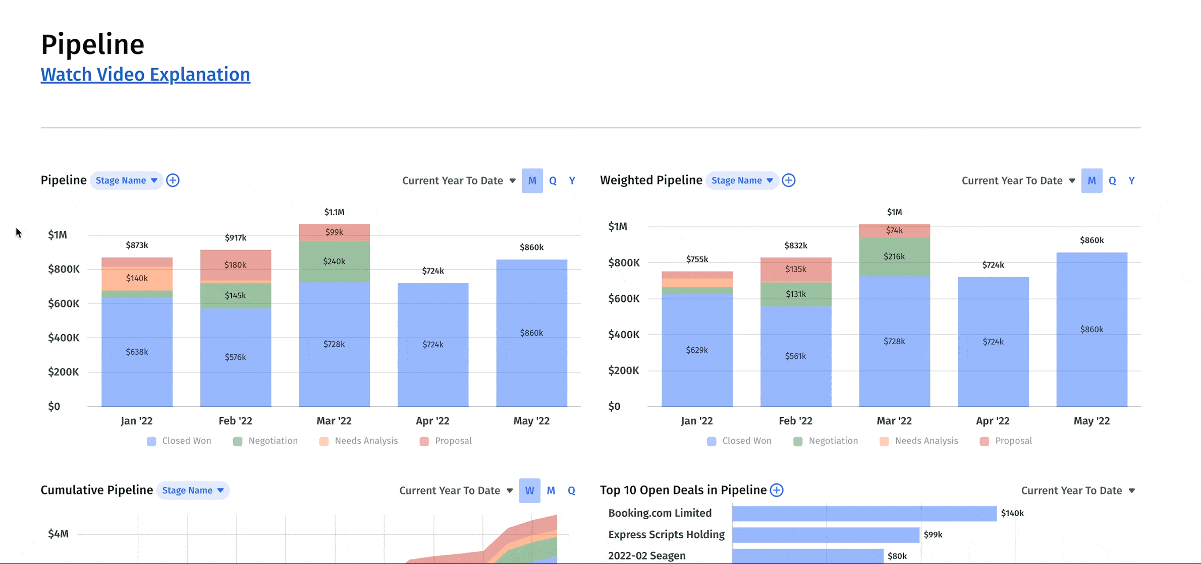
1. Pipeline Analysis Dashboard
As the name suggests, this dashboard is all about your pipeline. That means following deals from when the opportunity is spotted to when the deal is won or lost. A pipeline analysis dashboard makes it easy to spot issues like lead generation problems. And you should be able to drill down to the granular details of each deal and sales rep performance.
With the information provided here, you can have more productive meetings between sales and marketing teams as you reflect upon past performance and plan for the future. You can use it to coach your sales reps by helping them identify where sales growth opportunities exist.
The metrics we’d include in a pipeline analysis dashboard are:
- Pipeline
- Weighted Pipeline
- Pipeline List
- Won/Lost Opportunities
- Bookings
- Stale Pipeline List
- Pipeline Report
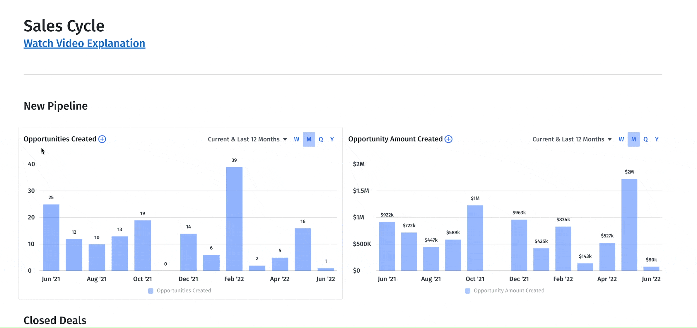
2. Sales Cycle Dashboard
This dashboard takes the above information and breaks it out based on each deal and where it is within the sales funnel. With it, you can understand whether your team is targeting the right leads, whether your product has a good (or bad) market fit, or if salespeople are performing well throughout the sales cycle. You can also use it to track changes in the sales cycle after implementing new sales or marketing strategies.
The metrics within the sales cycle dashboard include many metrics from the pipeline analysis dashboard, including won/lost opportunities and bookings. But what sets this dashboard apart is how it breaks out data so that you’re always viewing the information within the context of the sales cycle. So, in addition to the metrics above, you should also include:
- Deal conversion rate
- Days to close
- Sales cycle by sales rep
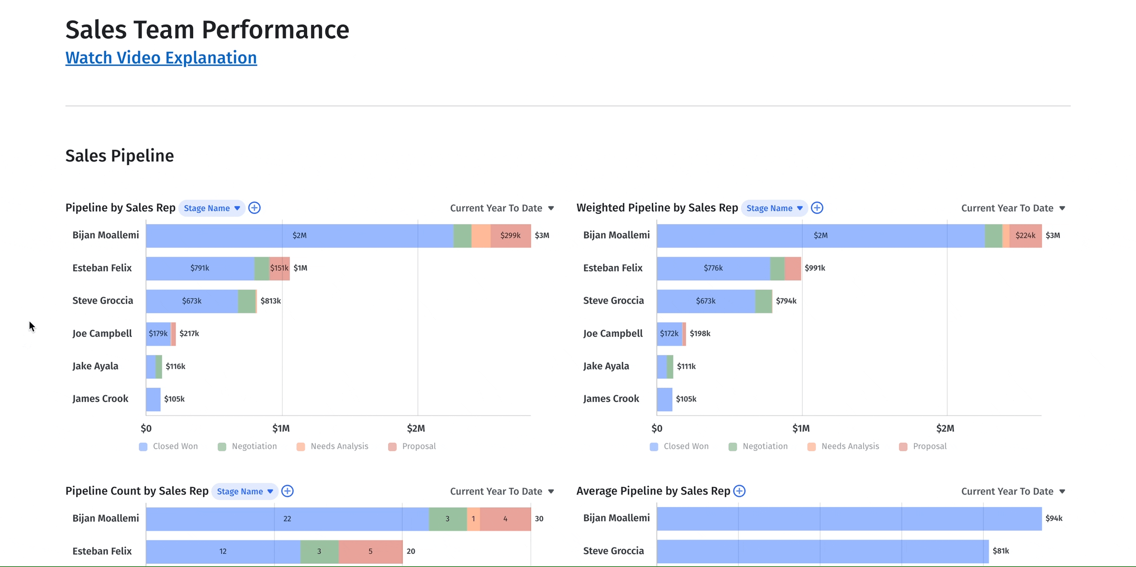
3. Sales Team Performance Dashboard
A sales team performance dashboard takes all the above information but breaks it out by sales rep. With it, you can track each rep’s performance and measure it against average performance. You can spot your outliers to understand why they are over or underperforming. And you can use it to forecast how many sales reps need to be brought on to help meet sales goals, plus how long it will take for them to be fully productive.
You can include many of the above sales performance metrics in this dashboard, but we think it’s especially important to track the following sales KPIs:
- Pipeline and weighted pipeline by sales rep
- Pipeline count by sales rep
- Average pipeline by sales rep
- Opportunities won/lost
- Bookings
- Sales rep efficiency
Build the Sales Dashboard You Need with Mosaic
Full visibility of your sales pipeline and team takes a lot of work with basic spreadsheets. Mosaic solves this issue by providing sales teams with interactive dashboards that spark data-driven insights and help managers optimize sales activities. Our dashboards integrate with business intelligence tools, so you’ll get all your data in one place without having to enter each data point manually.
You can hit the ground running with out-of-the-box dashboard templates to get you from zero to fully functional on day one. Of course, a sales dashboard doesn’t offer much if it can’t be tailored to your team’s needs now and as you grow. That’s why our dashboards and templates are fully customizable — you decide which metrics are most important, and you can choose where the information should be presented.
Ready to see how easy it is to track sales performance with Mosaic? Book a personalized demo and learn how our tools can take your sales team to the next level.
Sales Dashboard FAQs
What is the purpose of a sales dashboard?
A sales dashboard presents sales reporting in a visually appealing and easy-to-understand manner. It includes valuable information about your sales team, pipeline, and other performance metrics, ideally in real-time and using graphs and charts. Its purpose is to allow sales leaders and team members to quickly understand sales performance, which leads to better, more strategic decision-making.
What should a sales dashboard include?
Can you build a sales dashboard in Excel?


Own the of your business.