

A cohort analysis—analyzing the behavior of your customers based on their similarities within a given timeframe—is a powerful way to understand net revenue retention, growth, and customer lifetime value (LTV).
But if you’re defaulting to cohort analysis in Excel or Sheets, you may be losing countless hours on data entry, formula configuration, and data manipulation that could be better spent on growth activities like figuring out how to lower your customer acquisition cost (CAC) or optimizing your sales ramp.
Instead of relying on spreadsheets for your customer cohort analysis, shift to a strategic finance platform to automate the tedious steps so you can focus on unlocking key insights about your customer base.
How to Run a Cohort Analysis in Excel
Cohort modeling and cohort analysis are some of the most complicated spreadsheet use cases for any finance team. The calculations can be complex and the cascading formulas present challenges when trying to make changes after you set up the initial model.
There are countless ways of performing cohort analysis in Excel. For the purposes of this explanation, we’ll use a time-based cohort example — a SaaS revenue waterfall model.
1. Understand the Goal of Your Cohort Analysis
Because of the complexity and time-intensive nature of running a cohort analysis in Excel, you need a clear understanding of why you’re going through the exercise in the first place if you want to avoid wasting energy and resources.
In the case of a SaaS revenue waterfall model, you’re using cohort analysis to better understand how booked revenue from customer cohorts — grouped by the month they signed on as new customers — on subscription plans translates into recognized GAAP revenue.
Mapping out bookings to revenue waterfall is crucial to understanding how your business model will generate cash flow, not just ARR growth.
2. Define the Parameters of the Analysis
Once you know your goal, you need to plot the path to go from raw customer data to usable cohorted data. For a SaaS revenue waterfall, that means having the following inputs:
- Timeframe. Determine the starting and ending point for the cohort analysis. For example, you may want a three-year window to analyze cohorted bookings-to-revenue data.
- New bookings forecast. Forecasted ARR is the primary metric you analyze with a Saas revenue waterfall. You need 36 months of forecasted new bookings to build the cohorts.
- Bookings from retention and churn. Complete the ARR forecast by accounting for bookings from retention and churned customers.
- Revenue recognition schedule. Set the rules for how you recognize revenue according to GAAP standards.
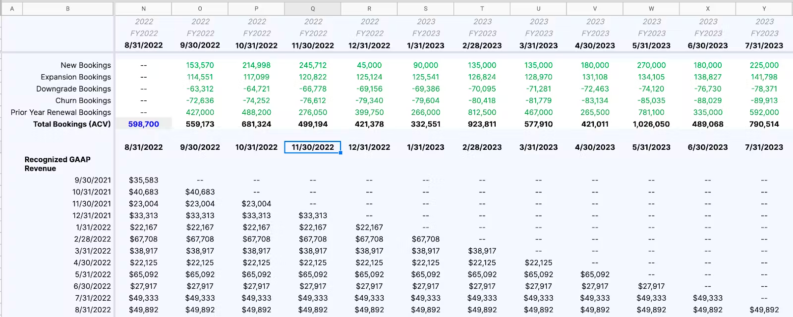
Cleaning your data and building out columns and rows for these inputs is perhaps the most time-consuming part of a cohort analysis in Excel. In this SaaS revenue waterfall example, the final structure of the bookings inputs might look like the following.
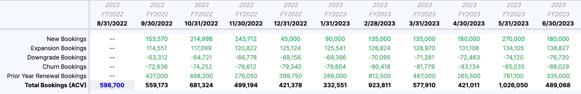
3. Create Formulas for Cohort Calculations
The simplest version of this cohort analysis example is to assume 12-month contract periods. This would make the revenue recognition schedule 12 months, meaning each cohort recognizes 8.33% of revenue per month.
Using SUMIF formulas, you can use this revenue recognition schedule to create the waterfall effect in this cohort analysis. In our example, the formula should be: SUMIF(total bookings row, forecast period row, cohort month) / 12.
If you set everything up correctly, it should look like this:
The Pitfalls of Spreadsheets for Cohort Analysis
Spreadsheets have always gotten the job done for finance teams conducting cohort analysis. But just because you can set up your cohorts in Excel doesn’t mean you should (or should have to).
The modern finance team has to be agile—capable of providing answers to strategic questions quickly and keeping pace with rapid business change. Complex, error-prone spreadsheets are no longer the best tools for the job.
They’re Prone to Manual Error
Creating a cohort analysis in a spreadsheet means handling large amounts of data points from numerous data sources. You need to pull contract start dates as well as retention and renewal data from your CRM and combine all that with revenue and collection data from your ERP. And if you’re building out your cohort analysis for a board deck or executive review, you’ll need to go through this manual data-entry process at least quarterly.
The sheer amount of manual work involved in this process creates typos, misaligned rows, copy/paste mistakes, missed cells, and other errors. There are plenty of spreadsheet horror stories from simple data entry mistakes—like when a missing minus led Fidelity to report a $1.3 billion gain to shareholders instead of a loss.
But errors in manual data entry don’t just cause reporting mistakes. Inaccurate data in your cohort analysis could lead you to double down on certain sales and marketing strategies that seemed to be working, but actually weren’t. And that kind of strategic misguidance could hurt your company’s growth potential.
They Take Hours to Set Up (At Best)
Pulling data from your business systems is only the first step to cohort analysis in Excel. Once you have all the raw data in your spreadsheet, you still have to spend hours cleaning that data before even starting the time-consuming process of building visualizations.
Beyond data collection and cleansing, grouping cohorts is one of the most time-intensive aspects of spreadsheet-based analysis. Are you doing time-based cohorts? Segment-based cohorts for specific product lines or service levels? Size-based cohorts to analyze the breakdown of your customer segments? Customizing your cohort analysis spreadsheet with these groupings can be tedious. And if you’re creating multiple views of your cohort analysis to unlock more strategic insights about the customer base, you’ll need to go through the configuration process multiple times.
A cohort analysis is only as valuable as the strategic insights you can get from it. If you’re spending all your time setting up a spreadsheet, your insights will be stale by the time they make it to your business partners.
They Make Collaboration Difficult
Once you’ve created your spreadsheet-based cohort analysis, using it to collaborate with other colleagues, company leadership, or stakeholders isn’t easy.
It’s great that you’ve taken the time to scrub all your data and build your cohort view. But the real value of the exercise lies in analyzing the trends and helping your business partners understand why one cohort is outperforming or underperforming the rest. Spreadsheets make it almost impossible to aggregate data and drill down into it in a way that highlights these kinds of insights.
Instead, spreadsheet-based cohort analyses can feel like a complex mix of financial data that doesn’t mean much to people outside of finance. A modern finance function speaks the same language as the business, which is why a more flexible solution that uncovers the “why” behind your numbers is so valuable.
They Can be Biased
The amount of time it takes to pull data and build cohort groupings opens the door for bias in your analysis. A basic time-based cohort analysis may be objective, showing quarterly revenue changes based on customer start date. But bias comes in when you start to further segment the data and dig deeper.
Because spreadsheet-based cohort analysis takes so much time to set up, you may have to limit your groupings and segments for the sake of speed. Selection and personal biases in those choices can hurt the objectivity of your analysis and limit the value of strategic insights. However, automating the data collection and grouping processes ensures you’re working from an objective baseline of customer information. Having that baseline will improve the quality of your strategic guidance—even if the insights are more subjective as you dig deep into the story behind your numbers.

How to Simplify Cohort Analysis with a Strategic Finance Platform
Mosaic is a Strategic Finance Platform that uses automation and accessible financial business intelligence to make your team more agile in planning and analysis.
The modern finance team doesn’t just report on the numbers—it tells the story behind the numbers to help guide strategic decision-making in the business. Ideally, cohort analysis should give business leaders (not just in finance) an easy way to understand how different strategic decisions have impacted upsells, net dollar retention, and usage over time. But the pitfalls of spreadsheet-based cohort analysis make it impossible to reach that ideal state.
Moving financial analytics out of Excel and into Mosaic eliminates the traditional pitfalls, simplifying your cohort analysis and helping you focus more on bringing strategic value to your business.
Automate Data Integration from Core Business Systems
Mosaic eliminates human error in your cohort analysis by automating data integration from your core business systems. Integrations with your CRM, ERP, HRIS, and billing systems ensure all necessary financial data remains updated in real time.
Real-time actuals give you a richer view of your customers for cohort analysis while ensuring you don’t have to worry about inaccuracies due to formatting or copy/paste errors in spreadsheets. The integrated data layer is your foundation for more dynamic cohort analyses that bring strategic value to the business.
Set Up Cohort Analysis Tables and Graphs in a Few Clicks
Mosaic’s financial metrics catalog gives you on-demand access to the KPIs that matter most to your business—including a variety of automated views of your customer cohorts. Below, you can see four different ways to view cohorts in Mosaic, which you can generate with just a couple of clicks.
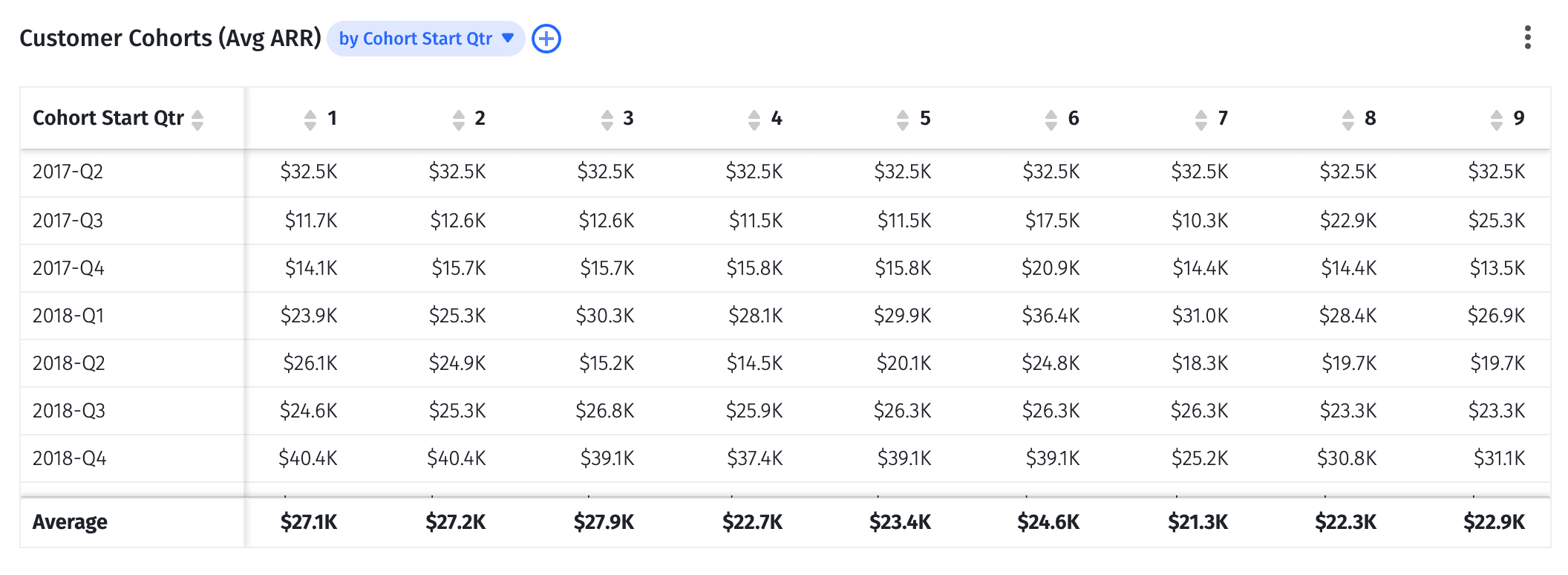
The four baseline views for cohort analysis in Mosaic are:
- Customer cohorts by average ARR
- Customer cohorts by net dollar retention percentage
- Customer cohort percent retention by ARR
- Customer cohorts by average MRR
But once you have these baseline cohort views, you can start manipulating the data and dig deeper for strategic insights.
Get Easy Access to Granular Cohort Data
Mosaic makes it easy to get more granular in your cohort analysis by adding more attributes to the baseline views listed above.
In any of the baseline views, you can add attributes like account name, industry, product line, support tier, and number of employees. Below, you can see a cohort analysis of net dollar retention broken out at the account level:
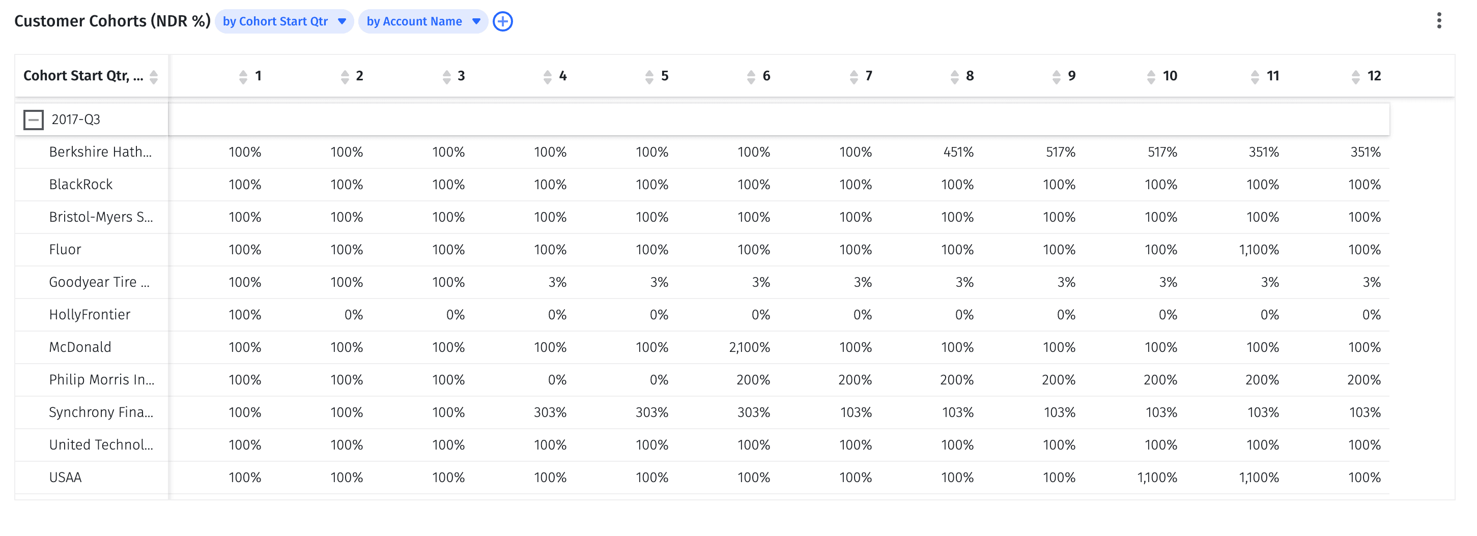
This kind of account granularity is where you can start investigating what’s going right or wrong in terms of customer retention, upsell strategies, and overall business growth. And it’s what helps you start building trust with business partners as you provide more actionable insights instead of complex financial data.
Quickly Build Visualizations for Better Cross-Functional Collaboration
Collaboration is easy with Mosaic because it enables you to build visualizations quickly and easily share access with business partners and board members. The automated platform eliminates version control issues with spreadsheets while also giving people outside of finance a more approachable environment for working with financial data.
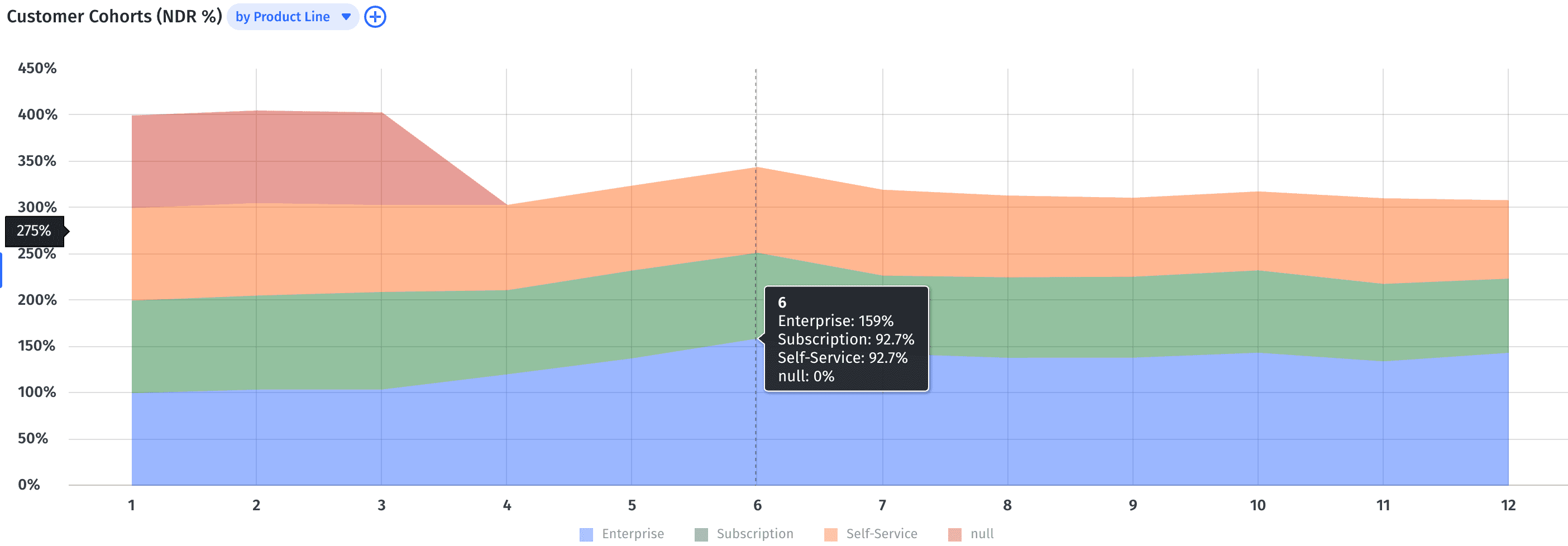
Any of the cohort analysis tables shown above can quickly convert into graphs that are most impactful for your business. The net dollar retention chart easily becomes an area chart broken down by product line:
You no longer have to provide your cohort analysis findings to your leadership team using spreadsheets, PDF files, or presentation decks during regular performance meetings. You can log into your Mosaic canvas and walk them through your newest updates together and manipulate data to answer questions on the spot. You can even have members of your leadership team create their own customized dashboards so they can see the cohort analysis data they need to track most as soon as they log in.
Make Cohort Analysis Work Better for your Business by Choosing the Right Tools
The finance world might never replace spreadsheets, but that doesn’t mean Excel and Sheets are perfect tools. There’s plenty of room to automate certain aspects of reporting and analysis to make finance more agile—and cohort analysis is a perfect example.
Don’t waste time configuring cohorts and visualizing data in complex spreadsheets. With our Strategic Finance Platform, you can work faster and more seamlessly with more reliable information empowering you to make the best choices for your business.
Request a demo today to see for yourself how easy cohort analysis can be.
Complete Sophisticated Cohort Analysis with Strategic Finance Software

FAQs About Cohort Analysis in Excel
What is cohort modeling?
Cohort modeling is forecasting using segmented data. SaaS startups use cohort modeling to create datasets and data analysis containing a group of users with common characteristics. Different cohorts can contain groups of customers based on company size, acquisition date, or similar to allow for easy data visualization and analysis.
One of the essential use cases for cohort modeling, especially in the SaaS industry, is tracking customer churn within these groups. By segmenting users into cohorts, businesses can better identify patterns and causes of churn, facilitating the development of targeted retention strategies.
Why is cohort analysis important?
How can Excel's features be optimized for a more detailed cohort analysis?


Own the of your business.