
Every business needs a reliable source of truth for all-things revenue and go-to-market numbers — and that source of truth should be your customer relationship management (CRM) system.
But just because Salesforce (or a comparable CRM) is your source of truth doesn’t mean it can handle every reporting request for people outside the sales team.
There’s a fine line between Salesforce reports and dashboards and deep revenue and go-to-market analysis. Here, we’ll walk through a Salesforce reports and dashboards tutorial to show how you can take advantage of native features of the CRM — and show how finance can help sales and executive leadership take another step to understand top-line growth trends.
Table of Contents
What Are Reports and Dashboards in Salesforce?
Reports in Salesforce are standard row and column lists that consist of filtered account records. Dashboards are a visual aggregation of either one or multiple reports broken into different visualizations, like pie charts or bar charts.
You can organize both reports and dashboards in Salesforce in folders, which you can share with other users or keep private as you put them together.
Salesforce Reports
Salesforce reports follow rule criteria, which you assign per report so Salesforce can automatically group or filter accounts accordingly. There are four standard report types in Salesforce:
- Tabular. Similar to Excel spreadsheets, tabular reports simply show lines of data without any assigning groups, calculations, or totals. This type of report is best suited for exporting data to another system.
- Summary. Summary reports follow grouping criteria for rows of data. For example, you can group your report by account name to see the number or value of opportunities per account. You also can assign subgroups.
- Matrix. Matrix reports are the next step up from summary reports in that you can group data by columns to see different totals, such as the value of opportunities per account by month.
- Joined reports. Joined reports allow you to compare data between two unrelated reports in one view, which allows you to consider a more holistic picture of your Salesforce data. One joined report example considers opportunities and cases for an account.
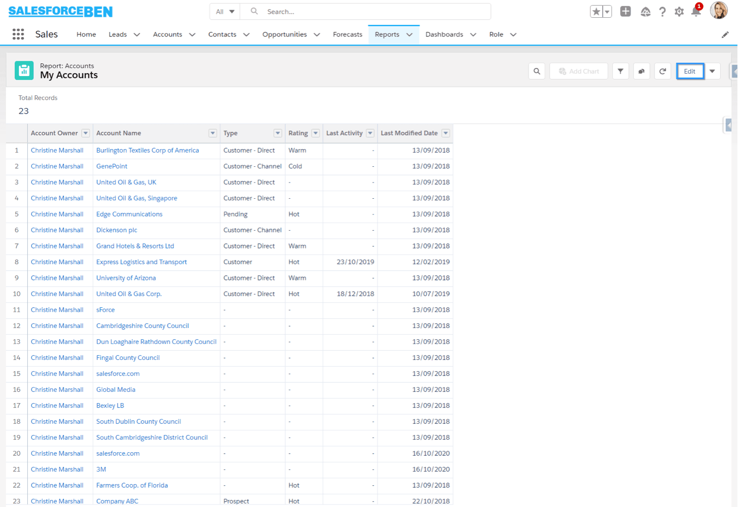
An example of a tabular report. Courtesy of SalesforceBen.
You can also create custom reports, which allow you to add custom fields, reorder sections, and assign default columns for new reports. And with each report, you can create a visual chart to accompany the report.
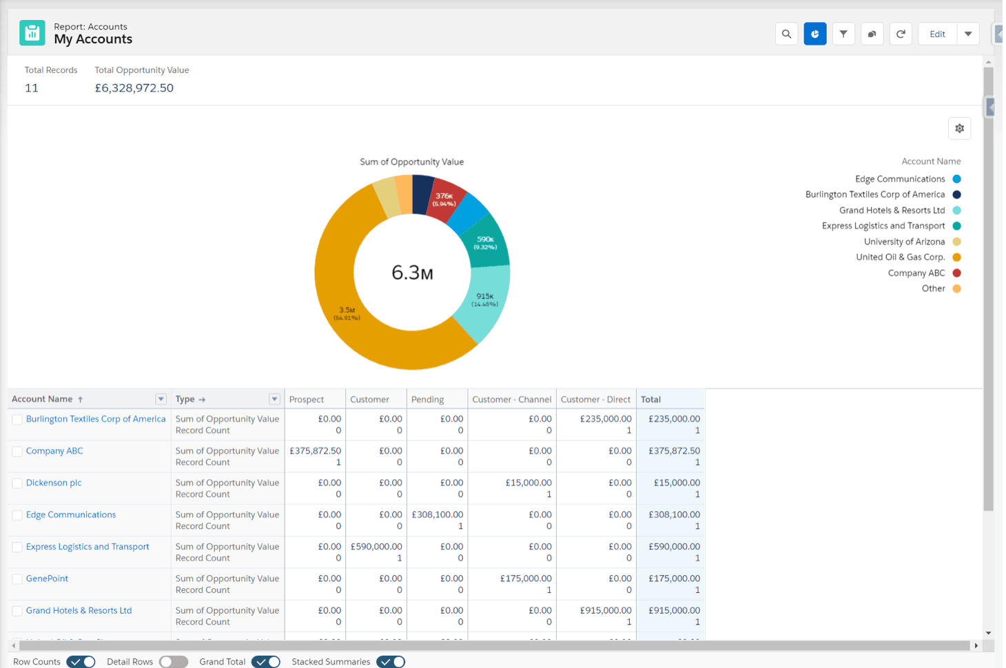
A Salesforce report with a chart application. Courtesy of SalesforceBen.
While you can create custom reports and all four types of Salesforce reports in Salesforce Classic and Lightning, your tier (what Salesforce refers to as “edition”) determines how much data each report contains. Salesforce Classic only allows up to 250 groups (4,000 values) per chart, whereas Salesforce Lightning Experience allows up to 2,000. For custom reports, the Professional Edition allows for 50, while Unlimited and Performance Editions allow for 2,000 custom reports.
Salesforce Dashboards
Dashboards are visualizations you can build from the same or different reports. There are four primary components (what Salesforce refers to as “reports” at this stage) that you’ll find valuable:
- Charts. Charts are a great visual tool for comparisons. You have the option to display your data as a pie, donut, horizontal or vertical bars, line, or funnel chart.
- Table. Your table is a list view, such as the top five opportunities.
- Gauge. If you need to report on progress, the gauge is the proper visualization tool.
- Metric. Salesforce deems the metric view as a single number with a specific label, such as a total in the pipeline or a closed-won deal total.
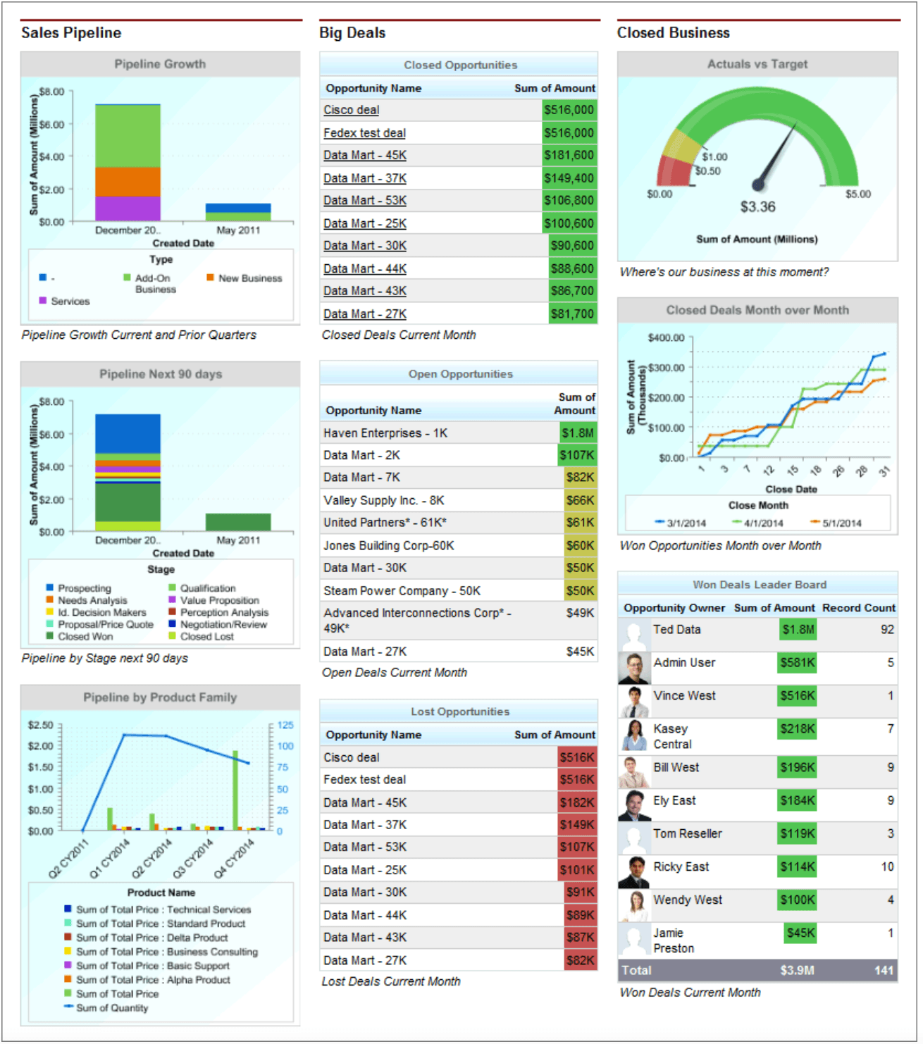
Sample of a Sales Executive Dashboard. Courtesy of Salesforce.
Regardless of edition, dashboards can have up to 20 components with a filter for up to 50 values. Filtering is also restricted for dashboards that contain multiple reports — for example, you can’t filter for the “Assigned” sales rep if the dashboard has one component with Activities with Accounts or Activities with Contacts and another component is a different type of report.
When creating a dashboard, it’s important to consider the “running user” — the person in charge of the dashboard. Each running user has specified security and sharing settings, which impact who they can share with and what information is available to show in the dashboard. This also means that the running user cannot integrate reports from other workspaces into a dashboard.
The running user can also create dynamic dashboards, which update in real time and are customizable to tailor them for a specific viewer’s interests. (Like when the executive team wants a quick update on sales pipeline totals for the current month.)
Just like with Salesforce reporting, Salesforce offers a limit as to how many dashboards you can have per edition across the company. The Professional Edition offers up to five dynamic dashboards, while the Unlimited and Professional Edition offers up to 10.
How to Get More Out of Your Salesforce Reports & Dashboards

How to Create Reports and Dashboards in Salesforce
Salesforce reports and dashboards have a 1:1 relationship — which means that to create a dashboard, you must begin with a report that will feed the visualizations within the dashboard.
You need to know what type of report you want to make from the start — because once you filter or group the data (like selecting “Contacts & Accounts”), and you realize you actually want data around opportunities, you’ll have to start over. Before you jump into the report, pause and make sure you have exactly what you need. These four quick points allow you to set your intentions for a Salesforce report and dashboard:
- Start with knowing what question you want to answer.
- Understand what objects you need.
- Then, pull the data and filter for the relevant timeframes you want to review.
- Get the fields that are the most relevant to you and your audience, then add a chart on top of it to offer another view.
How to Create a Report in Salesforce
Salesforce will always pull your data into a table format, and then you can add a chart on top of it to progress it into a summary or matrix. So, let’s begin at the very beginning and start with a new report for the total pipeline generation for the fiscal year (or up to whenever you run this report).
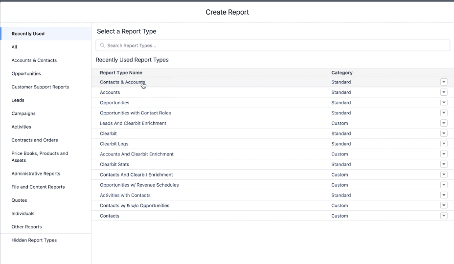
1. Click “New Report” from the Reports tab.
2. Select or search for a Report Type from the provided list. For this report, we selected “opportunities” and decided to look at “Opportunities with Contact Roles.” Once you make your selection, click “Start Report.”
3. Ask yourself what columns (outline) and filters you want for your data. Select filters, then apply we selected “all opportunities, all time, closed-won, and closed-lost.”
4. Depending on your historical data, you may have quite a few hundred or thousand rows. This is not your report — consider this view as a preview of the entire report, as you can only view up to a certain amount of records. This is where you can apply groupings based on your goal. (This report’s goal is to look at the total amount.)
Under “Outline,” go to “Groups” and “Columns.” Select your group (“Opportunity Name,”) then filter through the columns to select only the relevant information. (For this report, we added an “Amount” field/column, then built the report further with “Account Name,” “# Account,” “Stage,” and “Close Date.”)
5. Under “Filters,” you can select the “Close Date” to assign a timeframe to the data, such as “Current FY (fiscal year).” Select “Apply” to apply your filter.
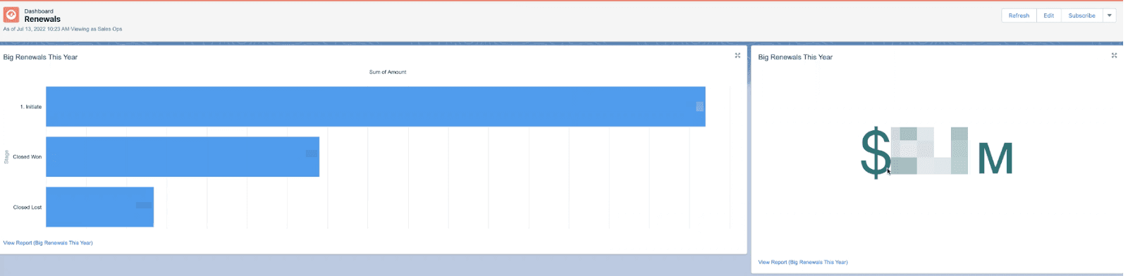
6. Select “Run” to fetch all the data (what couldn’t be included in your preview initially). This report accounts for every opportunity at any stage, aggregating toward the total amount field (automatically calculated in the column).
How to Create a Chart from Your Salesforce Report
While a tabular report sets the foundation for your dashboard and other report types, you may have more visual viewers. Here’s how you can take your report one step further with a chart (versus building an entire dashboard):
1. Once you run the report, you can click the “Add Chart” button. A bar chart immediately populates.
2. To change the chart type, click the asterisk-like icon and select a different chart type.
3. Go back to the report, where you can select a field to use as a group (either by rows or columns). For our chart, we selected “Group Rows by This Field” for “Close Date” and removed the “Opportunities Name” to display our total amount by each stage.
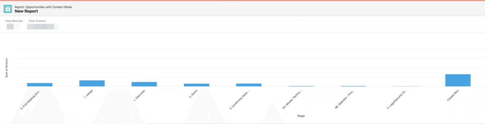
4. Hover your mouse over the columns in the chart to see the total number of accounts at each stage.
5. Select “Save and Run” to create the report. Make sure to rename the report and select the appropriate folder to store the report. (Remember, the folder also has the same security and sharing permissions as the running user.)
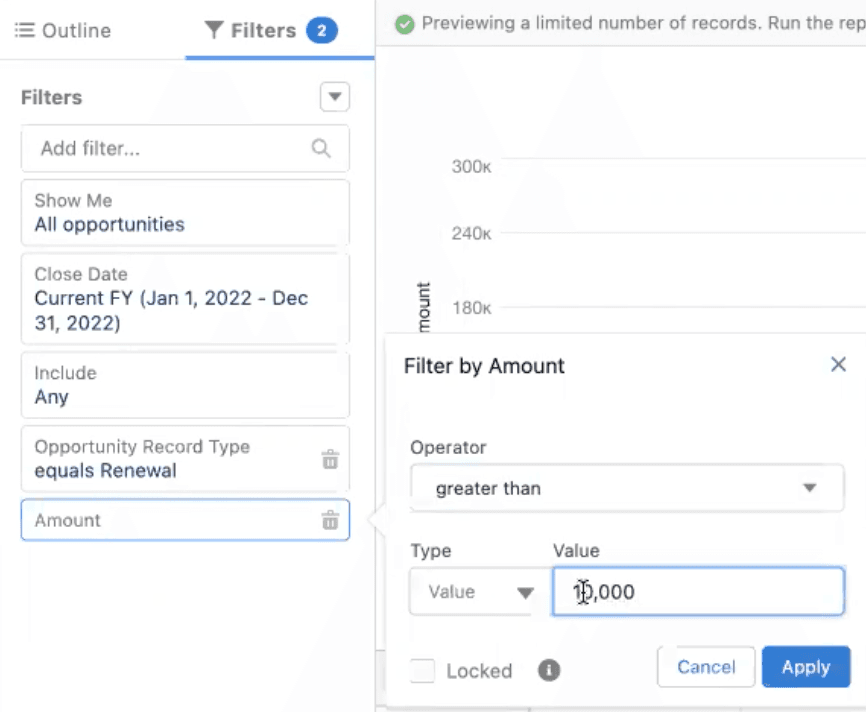
You can also filter the data further to gain more granularity, such as filtering for only the renewals (select “Opportunity Record Type,” then “Renewal”) in your pipeline to consider the total amount of money with renewal opportunities.
Salesforce also allows you to add “field logic,” which takes this chart even deeper. If an executive leader asks about the stages for only large renewal opportunities in your pipeline that would close this year, you can apply field logic to pull that data up.
Remember that the final step is to still “Save and Run” the report and store it in an appropriate folder.
How to Create a Dashboard in Salesforce
A dashboard allows you to curate reports in a shareable way. As an interactive platform, if a viewer needs to dive deeper into a dashboard component, they simply click the component and have access to the individual report. Again, you can include one report in multiple views or multiple reports with various charts, metrics, and tables. Here’s how to create a dashboard from a single report:
1. Go to “Dashboard” on your menu. Click the “New Dashboard” button.
2. Select the “Component” button to add a report to the dashboard.
3. You can choose how you would like to display the data. If you added a chart to your report, you could select “Use chart settings from report.”
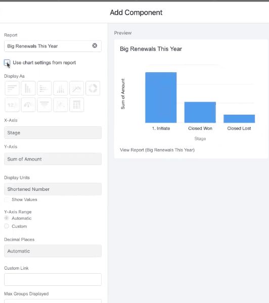
4. Click “Add” to add the chart. You can then drag the chart to a size of your choosing.
5. Click anywhere on the dashboard to repeat adding a component in a different view.
6. Once you select the same report, select a different visual display, then click “Add” to add it to the dashboard. You can then drag the visualization to resize or place it elsewhere on the dashboard.
7. Repeat the process until you have everything you need. Then, click “Save Dashboard.”
From the dashboard, you can click on the visualizations to dive deeper into the data and identify information, such as the specific accounts at an opportunity stage. Remember, however, that whatever your intent with the report and whatever fields and filters you used to create that data is the data you have access to at that moment. You can apply other reports to a dashboard as long as they are available to provide a wider view of whatever topic the dashboard covers.
How to Improve Salesforce Reports and Dashboards
The best way to improve Salesforce reports and dashboards is to contextualize CRM data with financial and operational data from other systems of record.
While Salesforce is a source of truth for pipeline and ARR data, it doesn’t track departmental headcount metrics, billings and collections metrics, or trend metrics like your sales rep ramp.
The sales team may benefit from Salesforce reports and dashboards, but the broader organization needs more granular insights. You need to be able to track trends in the sales cycle by measuring changes in time between stages. You need to be able to pull snapshots of pipeline data from historicals. And you need to be able to track the entire financial customer journey — beyond the pipeline and renewal data that reps enter in Salesforce.
Mosaic integrates with Salesforce directly to ensure CRM accuracy and real-time updates. But Mosaic takes your CRM data one step further by also integrating with your ERP, HRIS, and billing system to provide a holistic picture of the entire customer journey. The metrics Salesforce misses or can’t account for, like sales rep ramp, pipeline snapshots, and renewal trends, are easily accessible from one platform.
With Salesforce, you have to create every report and dashboard — there aren’t any ready-to-use, out-of-the-box options. Mosaic offers out-of-the-box metrics, templates, and dashboards to immediately begin mapping and visualizing your data, pulling from every source system to ensure fully-burdened, accurate metrics that supplement your Salesforce reports.

Harnessing Real-Time Data with Salesforce and Mosaic
While Salesforce provides point-in-time views of your pipeline and revenue metrics, you can’t uncover trends in the data or performance history. Mosaic has three dashboards that help uncover these strategic insights:
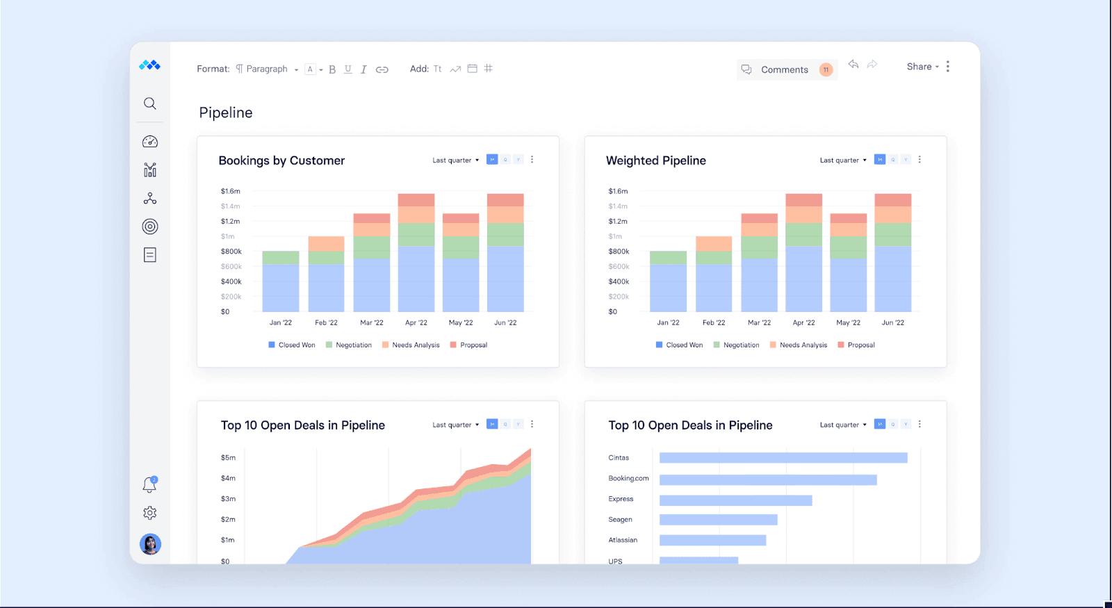
Pipeline Analysis Dashboard
Drive conversations with sales and marketing leaders while tracking your growth projections.
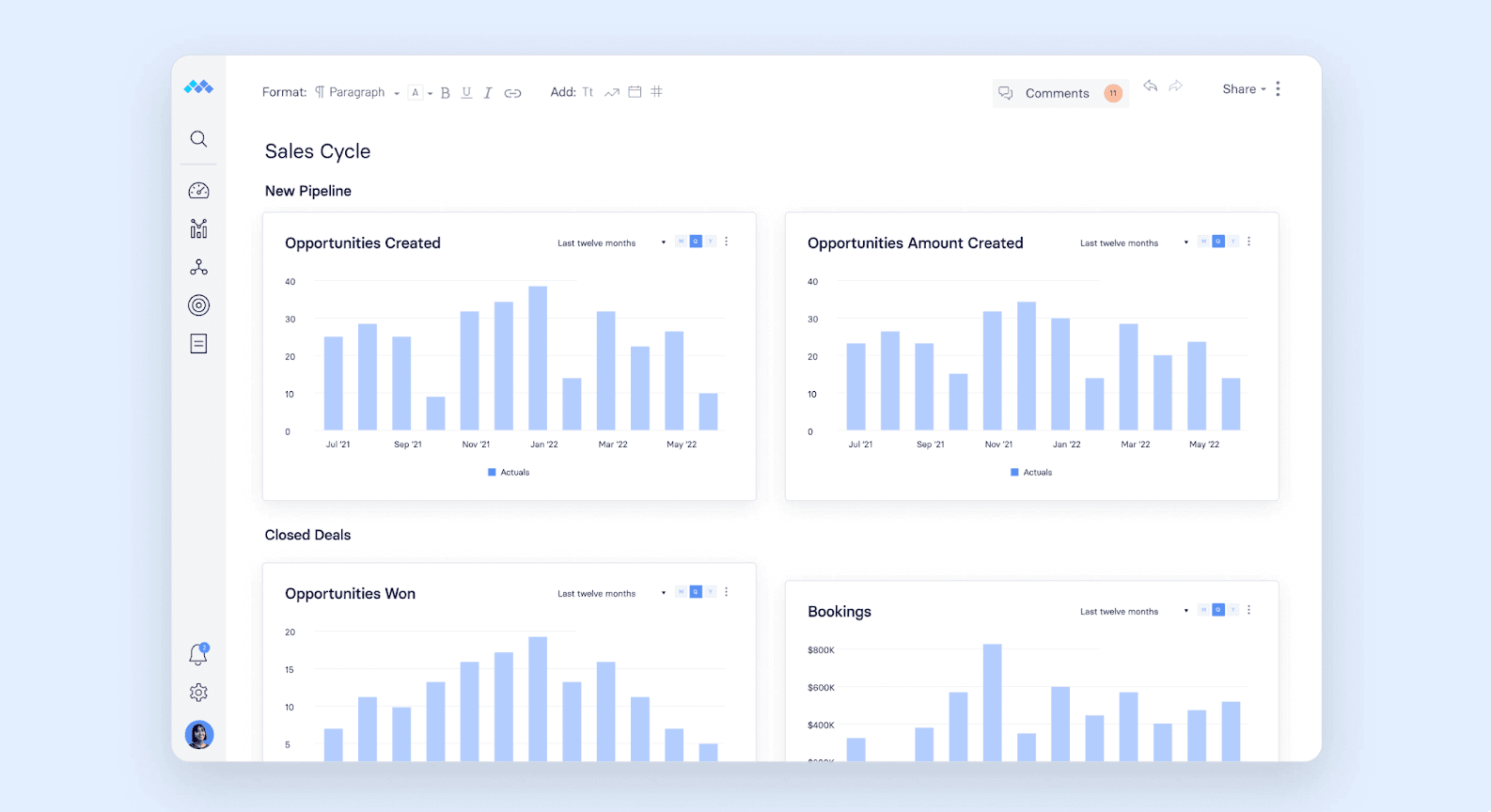
Sales Cycle Dashboard
This dashboard pulls ARR, non-SaaS ARR, and contract start/end dates to give you both historical and forecasted views of sales cycle trends. Since Mosaic also syncs with your source systems like your ERP, you can calculate more complex metrics like customer acquisition cost (CAC).
Sales Team Performance Dashboard
Dive deeper into the individual performance of your sales team. With your CRM and HRIS data sources in one view, you can provide sales leaders with insights that will improve headcount planning and top-line forecasting.
Ready to see how Mosaic can help you take your Salesforce reports and dashboards to the next level with automation and real-time updates that save you hours from creating reports and dashboards? It’s time to take action to save you ample hours from data manipulation and report creation.
Read our ebook, Finance’s Complete Guide to CRM Hygiene, to learn how you can set your CRM system up for success as the company continues to grow, and request a personalized demo to see how our dashboards can save you time and get you closer to the metrics that matter.
Salesforce Reports and Dashboards FAQs
What is the difference between reports and dashboards in Salesforce?
Salesforce reports and dashboards have a 1:1 relationship but display data in different ways. Reports begin in a tabular view (composed of rows and columns) that focus on a specific goal or insight, which requires you to have a specific goal in mind to create each report.
Dashboards are a visual display of the data from a single or multiple reports from the same workspace.
How many dashboards are there in Salesforce?
Does Salesforce integrate with Mosaic?


Own the of your business.