9 Financial Dashboard Examples for Strategic Decision Making

Joe Garafalo
Founder and COO

Download Our Strategic Financial Planning Blueprint
The average financial dashboard might look pretty. But more often than not, it’s not nearly as useful as it should be.
The problem is that financial dashboards make everyone feel like they’re running the business effectively—when in reality, they’re stuck in an inefficient, siloed cycle with the numbers. And that’s why the modern financial dashboard needs an upgrade.
Table of Contents
What Is a Financial Dashboard?
A financial dashboard is a tool that helps you visualize and more easily understand financial data. Financial dashboards can be tailored to your unique needs and are often used by CFOs, their teams, and business partners to track important financial and operational metrics and KPIs in real-time.
Financial dashboards are data visualization tools that help CFOs, their teams, and their partners across business units maintain real-time visibility of crucial operational and financial metrics.
9 Examples of Financial Dashboards
The following financial dashboard examples help you go beyond historical context and use real-time data to make finance more collaborative and strategic.
1. Sales & Marketing Financial Dashboard Example
A good sales and marketing financial dashboard gives the leaders in those departments insight into critical key performance indicators (KPIs) that drive strategic, forward-looking decision-making.
These teams are likely already using out-of-the-box reporting with tools like Salesforce and HubSpot to monitor some key financial KPIs. But the financial data available in those tools is incomplete.
For example, a CRM and marketing platform might calculate customer acquisition cost (CAC) on a high level with basic campaign spending and customer counts. But what about data on advertising spend, and software costs that live in the ERP? Or the data on salaries and commissions that lives in your HR system?
It’s finance’s job to give sales and marketing this kind of insight. The financial dashboard example below helps you do that.
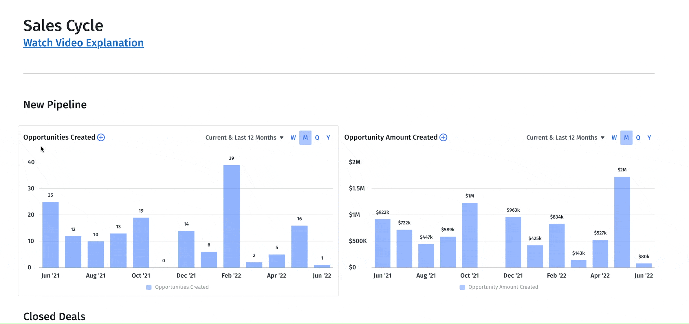
Example of a sales and marketing dashboard in Mosaic (Want to see it live? Get a demo.)
Without deeper financial context, sales and marketing leaders can’t solve tough strategic challenges. They’ll see that the pipeline changed, but they won’t know why. They’ll see they’re behind on next quarter’s revenue goals but won’t know how many reps they’ll need to catch up or how long it will take those new reps to ramp before they can contribute in a meaningful way.
Add these metrics to your sales and marketing dashboard to fill the gaps:
- Opportunities Created: Total deals created in the CRM
- Average Sales Cycle: Average number of days between deal creation and close date
- Deal Conversion Rates: % of opportunities which convert to closed-won deals
- Average Sale Price: Average booking amount per deal
- Sales Ramp: The amount of time it takes the average sales rep to start closing deals
- Annual Contract Value (ACV): The annual value of bookings from a given period (e.g., a two-year $200k booking has an ACV of $100k)
- SaaS Bookings: The total contract amount for all signed deals in date range
- Customer Count: Total active customers at the end of a given period
- CAC: All sales and marketing costs in a period divided by the total number of new customer starts in that same period
- Pipeline: Total amount of closed-won or open deals in the current period
- Revenue Retention: The percentage of net revenue retained broken out by ARR or MRR
2. Financial Performance Dashboard Example
Teams need a dedicated financial performance dashboard that helps them quickly understand the financial health of the business over different periods of time (such as trailing 12-months). This dashboard should help teams identify operational issues and pinpoint exactly how to solve them to free up time for more strategic tasks.
Normally, the end of each month comes with the same cycle of financial reporting and investigation. The previous month’s numbers come in, finance reviews for anomalies in the data, and then manually identifies and resolves any operational issues. For example, you might notice that cash out is unusually low compared to the previous month. You’ll need to dig into your spreadsheets to figure out which bills you haven’t paid and adjust the numbers once you’ve sent out the checks.
This example highlights operational insights, so you spend less time investigating issues.
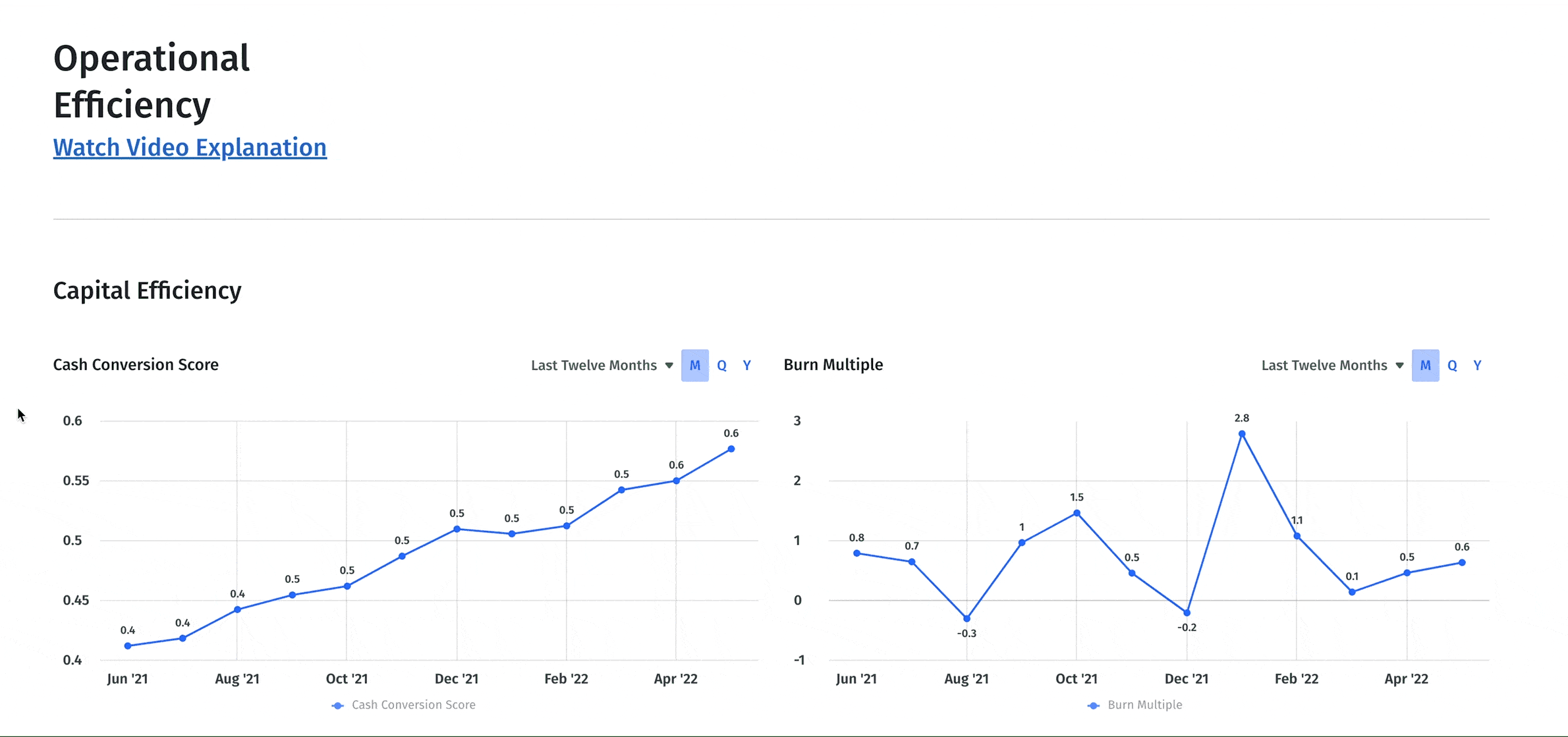
A financial performance dashboard should provide insight into operational efficiency. Include metrics like:
- Cash Conversion Score: ROI of dollars put into the business in terms of ARR generated against cash, equity, and debt
- Burn Multiple: Net burn divided by new ARR to show ROI of capital deployed
- Cash Inflow and Outflows: Net cash flow (cash in less cash out)
- Gross Profit: Profitability calculated by revenue less cost of revenue
- Gross Margin: Gross profit divided by total revenue
- Expense Composition: Total expenses broken down by percentage across key categories
- Net Operating Income: Total income less operating expenses like wages and cost of goods sold (COGS)
- Accounts Receivable (AR) Aging: Current amount of open invoices based on aging bucket
- Accounts Payable (AP) Aging: Current amount of open bills based on days since the bill date. (For more context, add your accounts payable turnover ratio to the dashboard.)
- Billings: Total amount of invoices less credit memos
- Collections: Total amount of customer payments
3. The CFO Dashboard Example
The right dashboard can help CFOs and their teams surface actionable insights so they can assume a more strategic advisory role for the business.
Traditional, backward-looking finance functions haven’t been able to play this part. They’ve been too bogged down in past numbers to give executives at-a-glance insights into big-picture financial data that can drive strategic decision-making.
When executives have real-time insight into financial metrics, they can speed up the board deck prep process and unlock the strategic value of board members. And they can make more informed decisions about things like the product roadmap, pricing changes, and budget allocation.
This CFO dashboard provides an overview of efficiency metrics and financial data so finance leaders can maintain a higher-level view of the company’s growth trajectory.
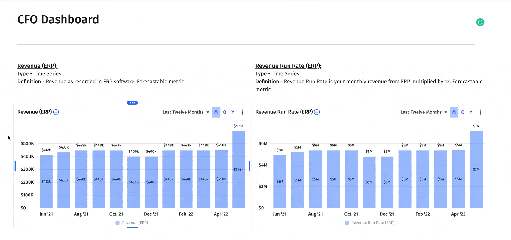
Finance leaders need total visibility into the financial and operational health of the business, which is why this dashboard should include metrics like:
- CAC: All sales and marketing costs in a period divided by total new customer starts in that same period
- Magic Number: An efficiency metric measuring ARR for a given period against the prior period’s CAC.
- Rule of 40: The revenue growth percentage plus profit margin percentage
- SaaS Quick Ratio: The ratio of revenue growth compared to churn and contraction growth.
- Customer Lifetime Value: The average amount of money expected over the life of a customer’s relationship with your business
- Revenue Retention: The percentage of net revenue retained broken out by ARR or MRR
- Cash Runway: The number of months until working capital is $0 at the current net burn rate
- Net Burn: Cash flow from operations (cash in less cash out) over a given period, excluding bank transfers and financing transactions
- Cash Balance: Total balance of “cash equivalent” accounts at the end of each period
- Recurring Revenue: Total amount of recurring revenue for a given period presented as either ARR, MRR, or annualized MRR
4. The Executive Dashboard
An executive dashboard should give C-suite members, investors, and board members high-level visibility into the health of your business.
These stakeholders may have specific questions that require additional financial analysis. But your first goal should be creating an at-a-glance status dashboard for the most relevant KPIs like in the example below.
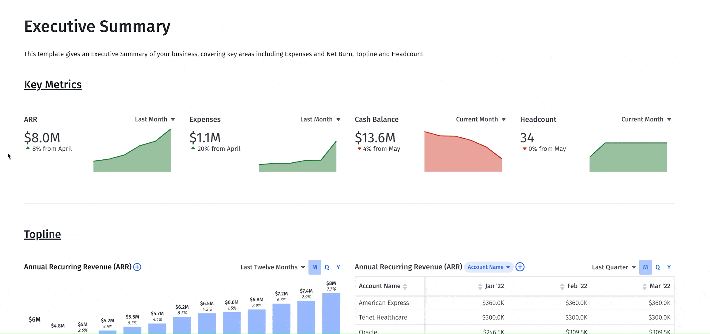
Think of this as an executive summary for your business — the kind you might include in a SaaS pitch deck or board meeting. Build your executive financial dashboard to include insight into key metrics like:
- ARR: Total ARR for the last twelve months as well as ARR by account name
- Cash Balance: The amount of money in the bank (including cash equivalents)
- Customer Count: Total size of the customer base.
- ARR Changes: Increases and decreases in ARR by new, upgrade, downgrade, and churn revenue
- Expenses by Account Category: Cost of goods sold and operating expenses by category
- Top 10 Vendors: A list of top vendors by expense
- Net Burn: Cash flow from operations (not including financing or bank transfers)
- Headcount Composition: Total headcount broken down by percentage per department
- Liquidity: Your ability to exchange existing assets for cash
5. Forecast vs. Actuals Financial Dashboard
A good forecast vs. actuals dashboard helps finance turn budget variance analysis from a basic reporting exercise to a strategic task.
First and foremost, the dashboard needs to provide an accurate baseline of the company’s plan (whether that’s a rolling forecast or traditional budget). But it also needs to make it easy for finance to drill down into the data. That means breaking the data down to the department and account levels as necessary, like in the example below.
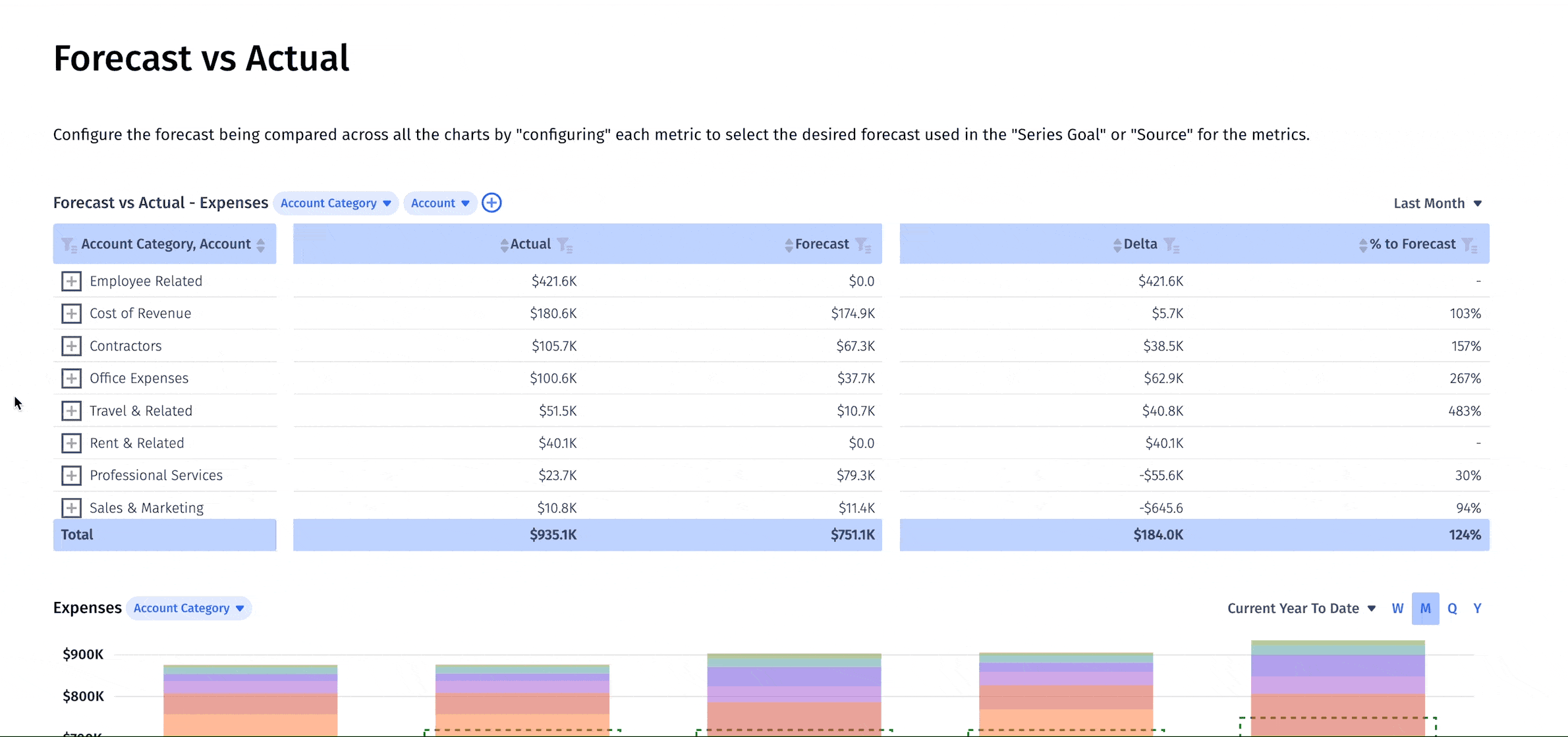
Consider the following metrics and KPIs for your forecast vs. actuals financial dashboard:
- Total revenue compared to plan
- A budget vs. actuals variance report for income statement groups
- Net burn compared to the budget
- Variance analysis for balance sheet forecasting
- Short-term cash balance compared to your goals
- Total headcount broken out by department
6. Cash Flow Analysis Dashboard
Any great finance leader needs to keep a finger on the pulse of the company’s lifeblood — its cash. And beyond that, you need to be able to forecast cash position accurately as strategic plans evolve.
A strong cash flow analysis dashboard is the key to doing both. It gives you a complete overview of cash coming into and going out of the business while creating a strong foundation for forecasting how strategic plans will impact cash flow.
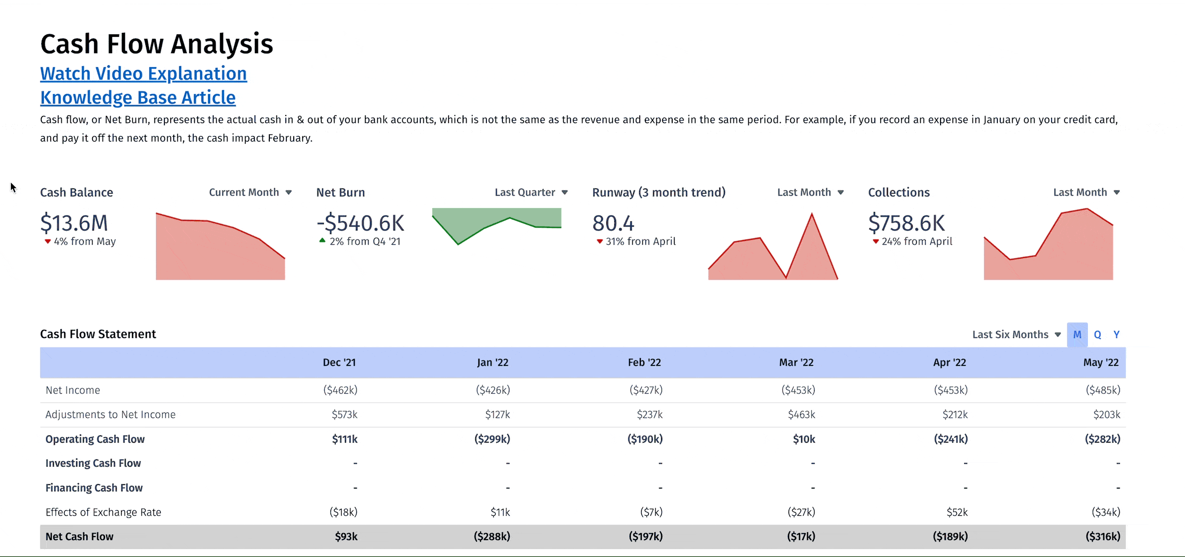
When you create a cash flow analysis dashboard, add crucial metrics such as:
- Cash Balance: A scorecard for real-time cash balance tracking
- Net Burn (including trends and changes): Point-in-time net burn as well as trends and changes in the metric
- Runway: The three-month trend for the months until you run out of cash
- Collections: A real-time tracker of how much revenue you’re collecting from customers
- Cash Flow Statement: Not a metric, but an updated view of your cash flow & financial statements for visibility
- Cash Inflows and Outflows: A measure of how much money is flowing into and out of your business
7. Headcount Analysis Dashboard
Headcount planning and workforce management are among the most important functions in any business — especially in SaaS where headcount makes up as much as 70% of total spend. This is why having a headcount analysis dashboard is so important for finance leaders.
Keeping a close eye on headcount changes is crucial for identifying trends that will improve headcount planning. And it will also show you whether or not you’re on track to hit hiring plans that are critical to growth.
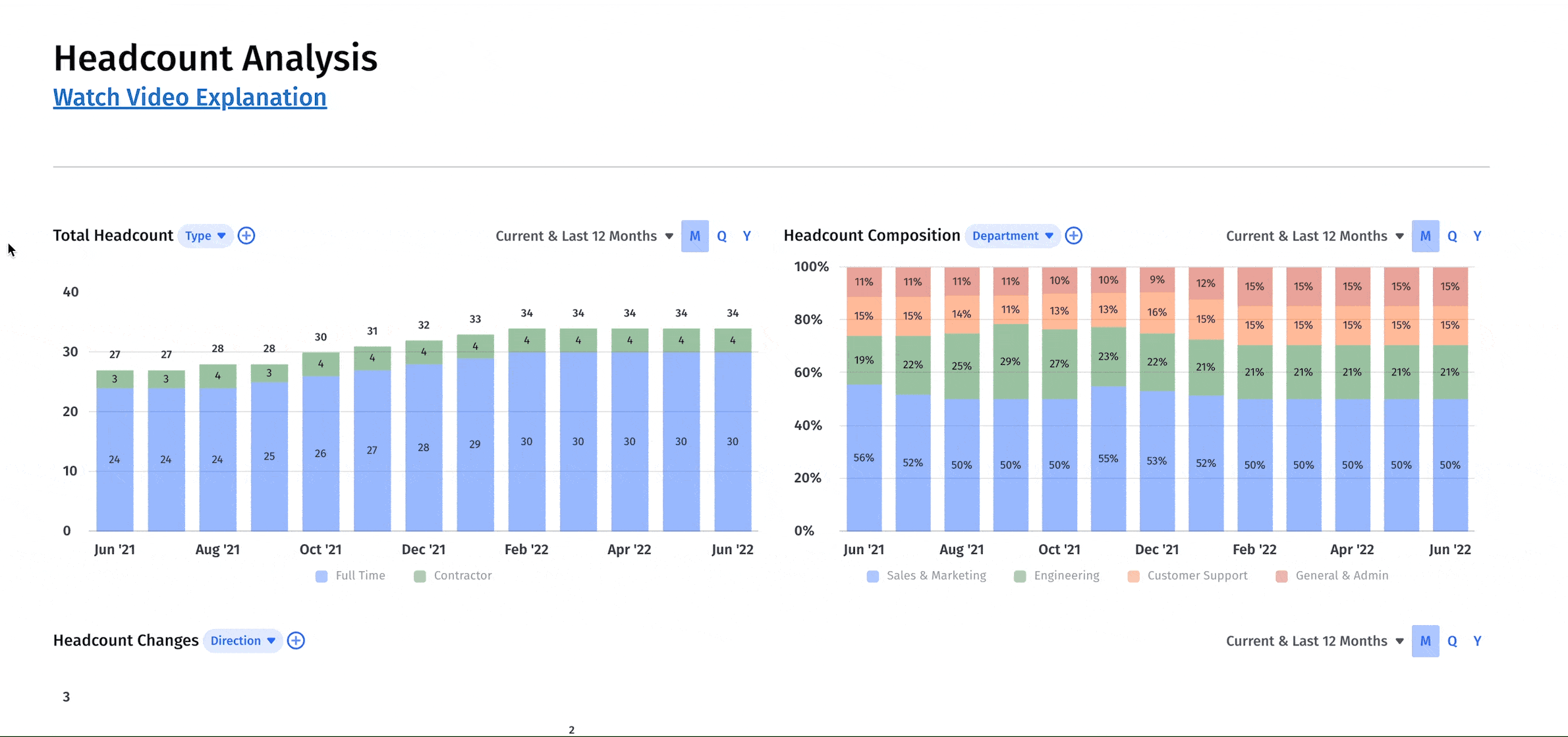
When you create your headcount analysis dashboard, include metrics like:
- Total Headcount: A running total of the number of employees at your company
- Headcount Composition: A breakdown of total headcount by department
- Headcount Changes: A clear trend graph of how headcount increases (or decreases) month to month
- Headcount Start and End Lists: Tables that show individual employee starts and ends for a given period
- Employee Retention Percentage: The percentage of employees retained month to month
8. Pipeline Analysis Dashboard
In addition to a sales and marketing dashboard, you may want another financial dashboard specifically for pipeline analysis. This visualization will show you potential pipeline generation issues and granular insight into deal stages.
You can use a pipeline analysis dashboard to have deeper conversations with sales and marketing leaders throughout the quarter. If you aren’t tracking to your growth projections, this analysis can help you understand why.
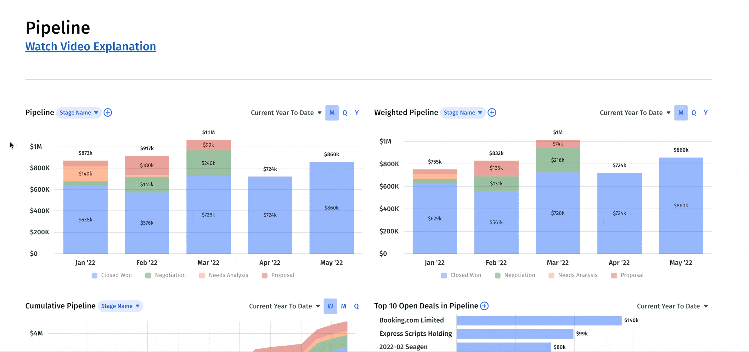
The metrics in a pipeline analysis dashboard include:
- Pipeline and Weighted Pipeline: Total amount of closed-won and open deals for the period as well as a probability-weighted version of those deals
- Cumulative Pipeline: Running total of open or closed-won pipeline period over period
- Top 10 Open Deals in Pipeline: Clear view of which deals account for the most pipeline in the period
- Pipeline List: A more granular view of the pipeline including all deals, their stages, owners, and sales cycles
- Closed-Won and Closed-Lost Lists: A detailed list of all won and lost opportunities for the period
- Bookings: Total value of all deals signed in the period (including existing and new business)
- Stale Pipeline List: An overview of deals that are open but have closed dates in prior periods
9. SaaS Acquisition Metrics Dashboard
Growth is the name of the game for SaaS companies. And while there may be a time and place for a “growth at all costs” mindset, finance leaders still need a clear view of how efficiently they’re driving that growth.
A SaaS acquisition metrics dashboard can provide a complete overview of the efficiency and effectiveness of all efforts to drive growth.
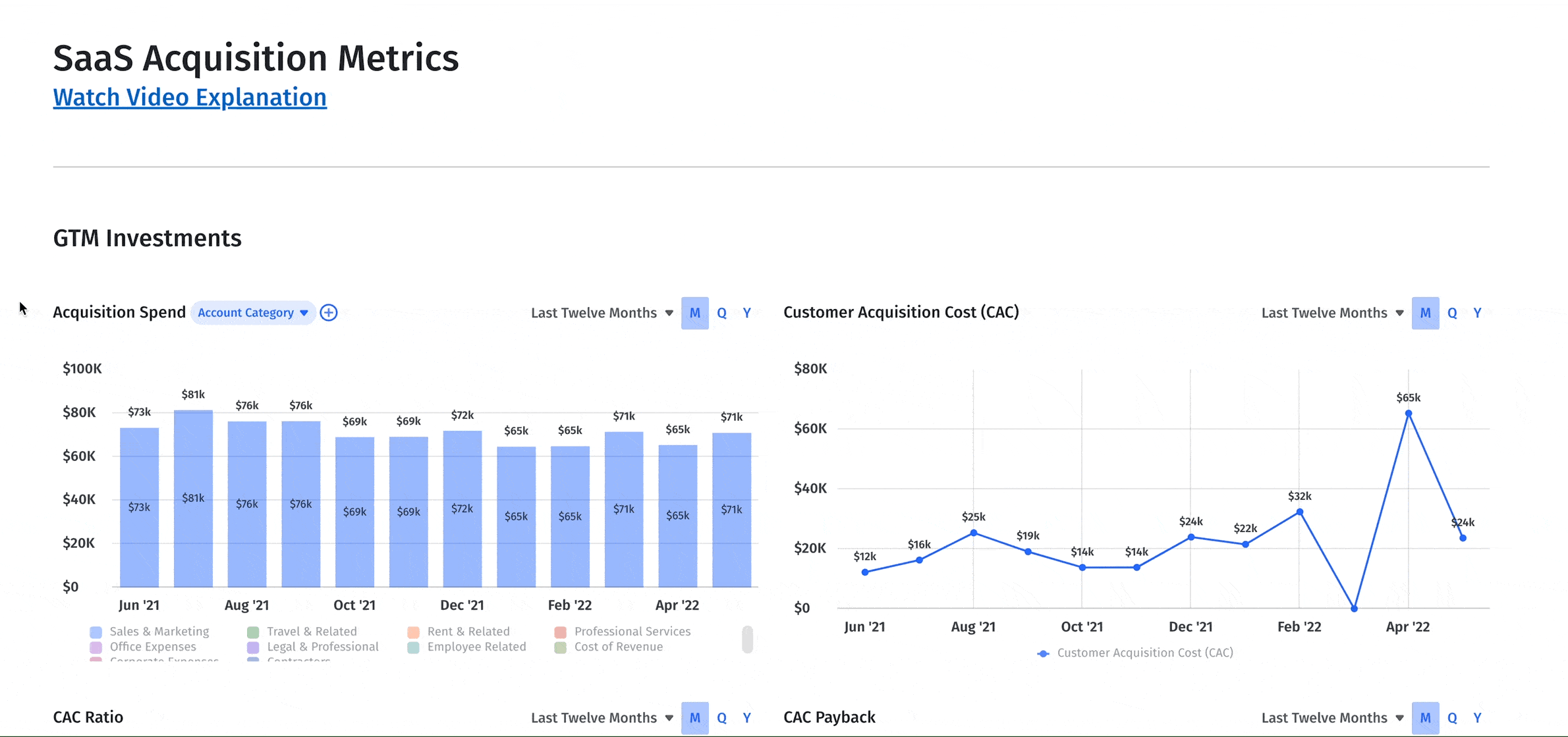
There are dozens of different SaaS financial metrics you could include in this dashboard. But the ones that are most critical are:
- Acquisition Spend: The fully-burdened cost to acquire new customers in the period
- Customer Acquisition Cost: The average cost to acquire one new customer in a given period
- CAC Ratio: The cost to acquire ARR (including new and upgraded business)
- CAC Payback: Projected number of months to recoup the costs of acquisition
- Customer Lifetime Value: Average amount of revenue expected per customer over the course of its lifetime
- SaaS Magic Number: A measure of sales and marketing efficiency
- Customer Cohorts Scheduled Revenue: Comparison of scheduled revenue between customer cohorts

Challenges of Financial Dashboards and Reporting
Designing and building financial dashboards can be a challenge because different teams need different data and insights — and pulling all of that information together is never easy, especially if you’re still using Excel spreadsheets.
While FP&A and sales dashboards are used to look ahead, accounting is tracking many of the same metrics to look backward. And even if you have an executive dashboard design that brings the two together, you still may not be basing business decisions on accurate financial numbers if your dashboard isn’t pulling data in real time.
The answer isn’t to add more financial dashboards to fill the gaps.
Rather, it’s to take advantage of financial business intelligence, a purpose-built way to pull data from its many sources and distill the numbers in a way that the entire business can understand.
Your dashboards can’t just present numbers on a screen — they need to highlight the story and insights behind the numbers to enable more strategic, real-time decision-making.

Want Better Collaboration? Turn Financial Dashboards into Canvases.
The average finance dashboard — even a powerful one built with a business intelligence (BI) tool — is a poor collaboration tool. It surfaces the numbers but fails to bring other business stakeholders into the financial conversation.
Mosaic’s canvas solves this problem. It’s part dashboard, part living document, letting you easily create, monitor, and share the right financial information with the right people at the right time.
Mosaic canvases go beyond the basic data visualization dashboards you’ll find in typical financial reporting software. They make BI and financial analytics more accessible by connecting directly to your most important data sources. These source system integrations automate metric calculations and allow anyone in the business to drag-and-drop charts and graphs, update scenario planning to see the financial impact in real time, and add context to the numbers with text comments. With the canvas, you get an interactive sandbox for collaboration between finance and the rest of the business.
A collaborative, modern finance function is one that can clearly tell the story behind the numbers to anyone in the business. That level of clarity is critical to strategic decision-making. And it’s why Mosaic canvases, pre-loaded with a number of financial dashboard templates, are the future of finance collaboration.
Want to see how easy it is to analyze and collaborate on financial numbers in Mosaic? Get a personalized demo and learn how you can start creating canvases based on real-time actuals.
Shift to Real-Time, Self-Service Financial Reporting

Financial Dashboard FAQs
What should a finance dashboard include?
Depending on the purpose of your financial dashboard there are different metrics you should include. A sales & marketing finance dashboard, for example, could include conversion rates and annual contract value (ACV), while a CFO financial dashboard could include revenue retention and net burn.